Civilian™ is for the design & development of different things, for different people.
Some projects.


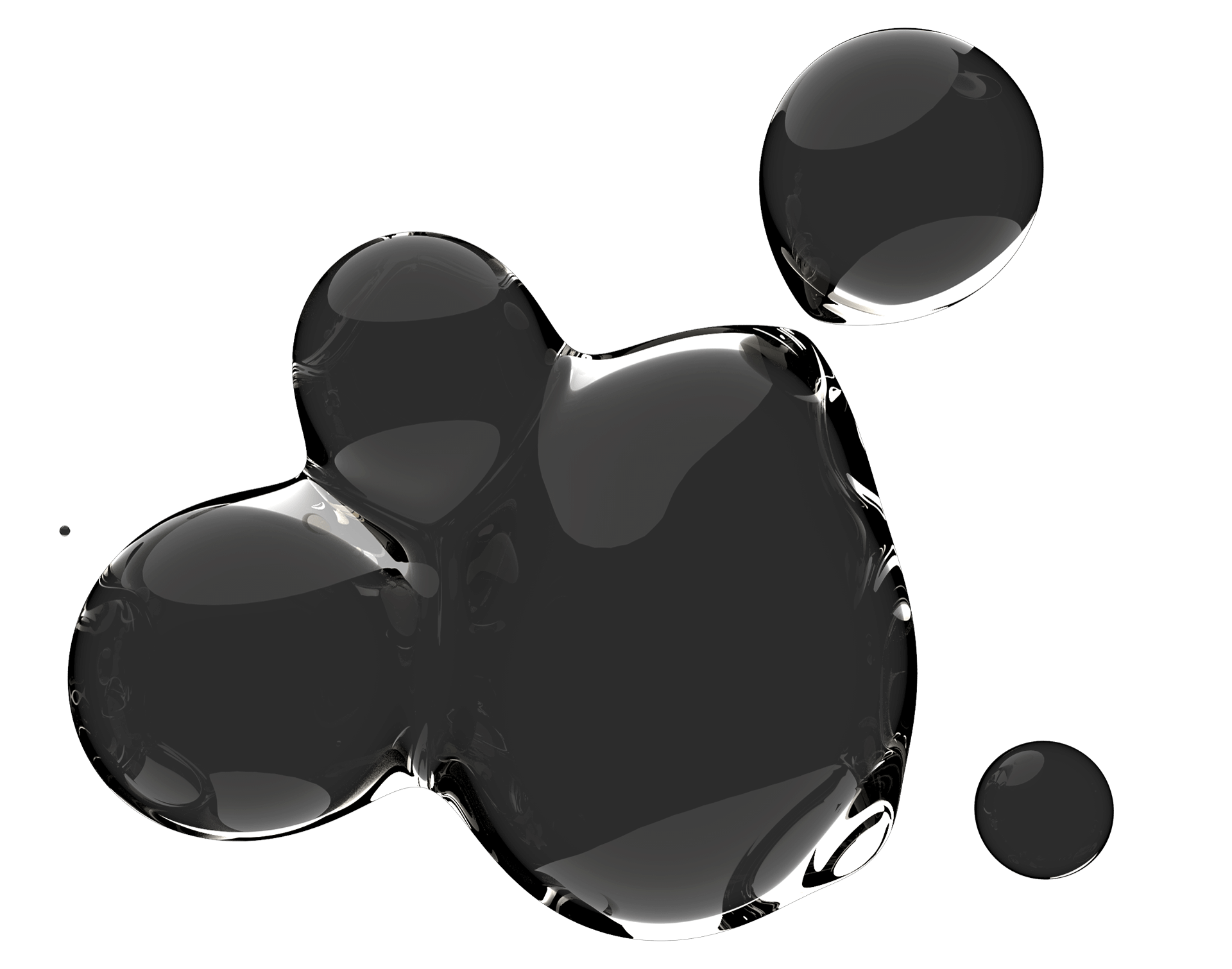
User Design™ ~ Viscous platter

Vytae ~ branding

Skateboard deck ~ graphics

M.O.S.T ~ 3D modeling and branding

User Design™ ~ octagonal table set

Ballantines X Felipe Pantone ~ stage + VJ booth

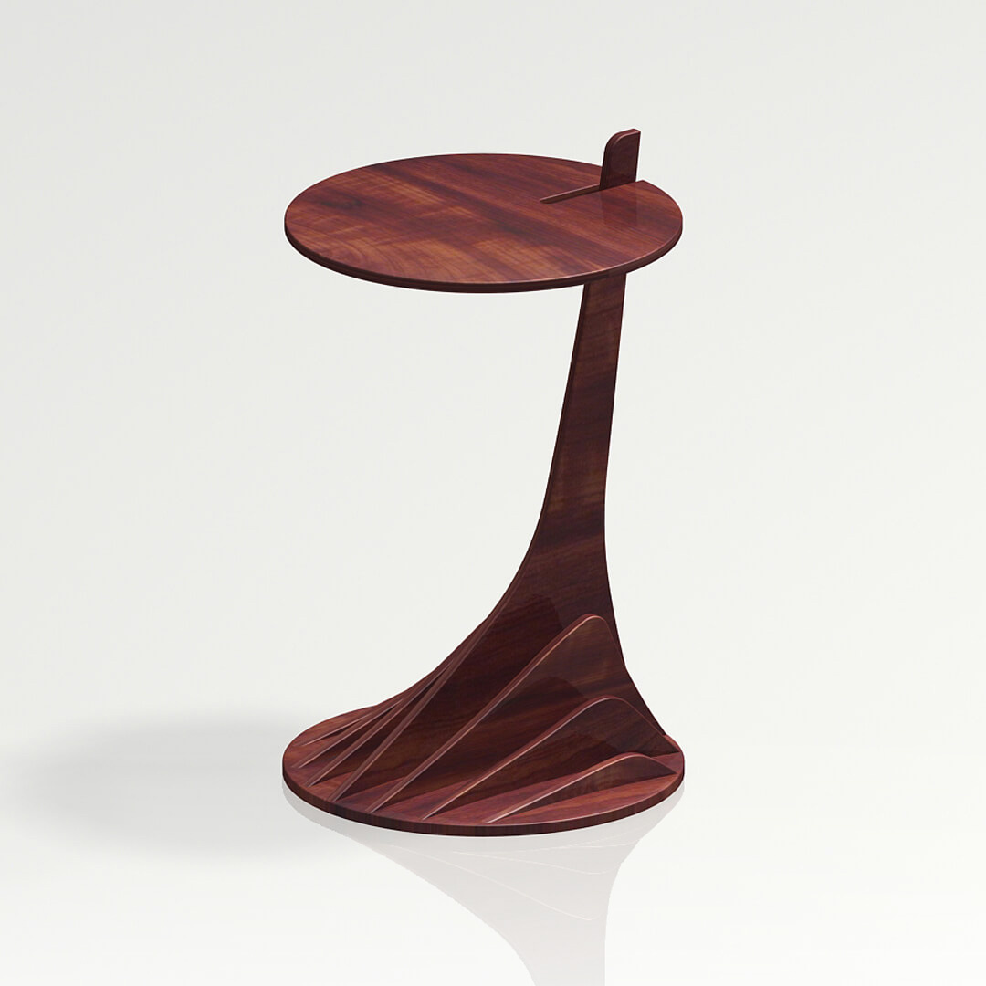
Hypnosis side table ~ furniture

Endemic Explorations ~ branding

Covid 1984 ~ graphics
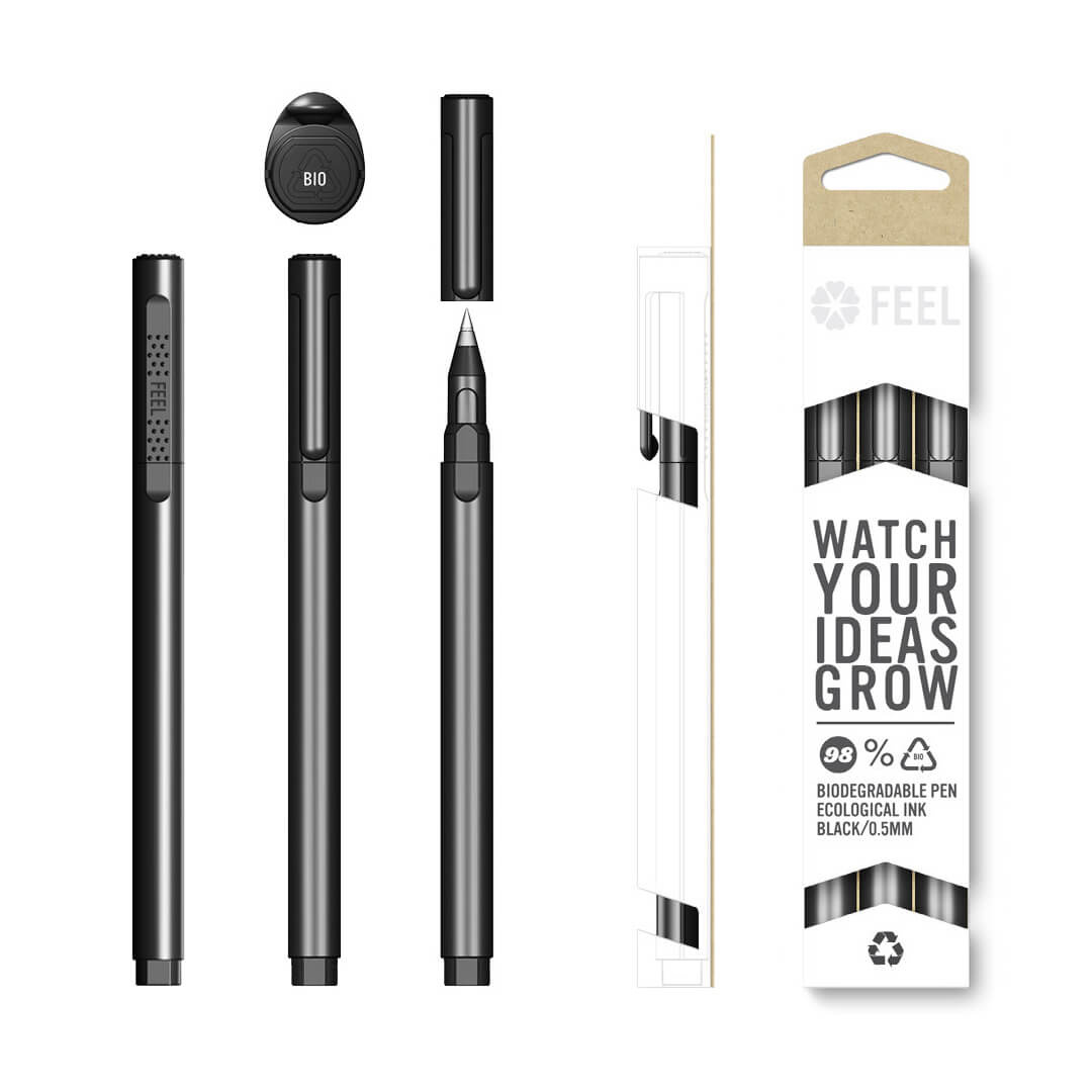
FEEL pen ~ product & packaging
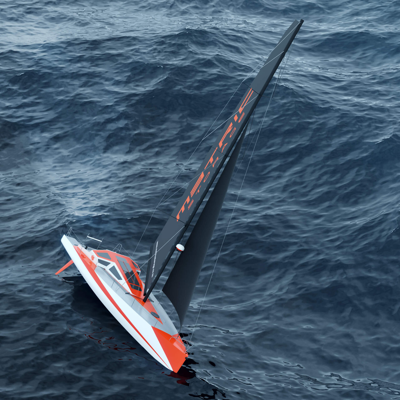
Metric Storage ~ branding

Waveshaper ~ logo development

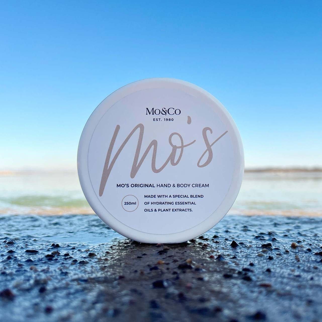
Mo&Co ~ branding

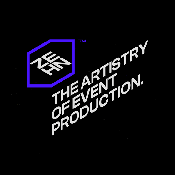
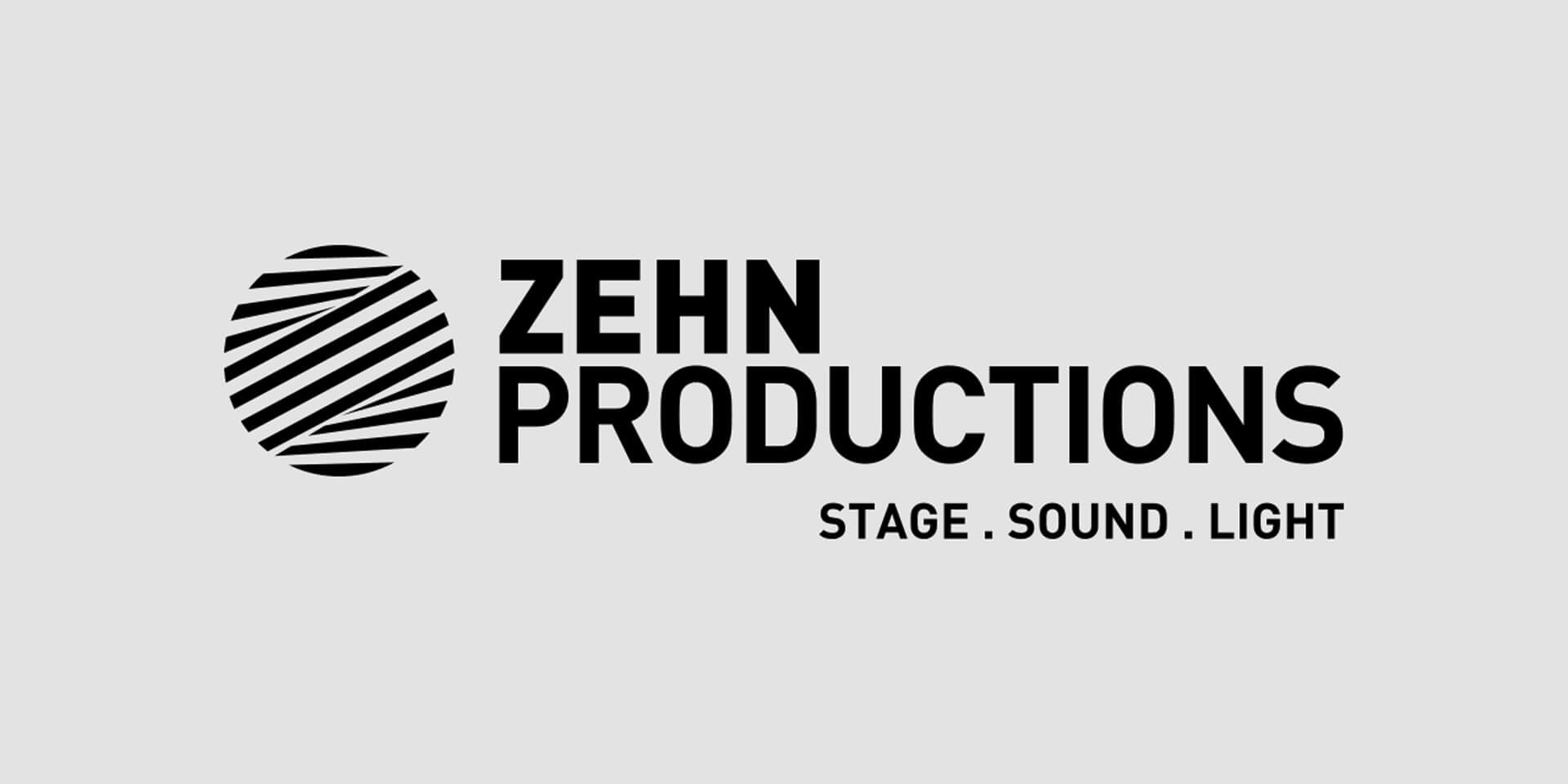
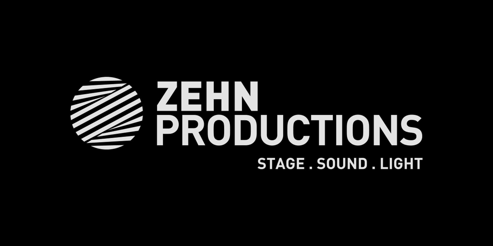
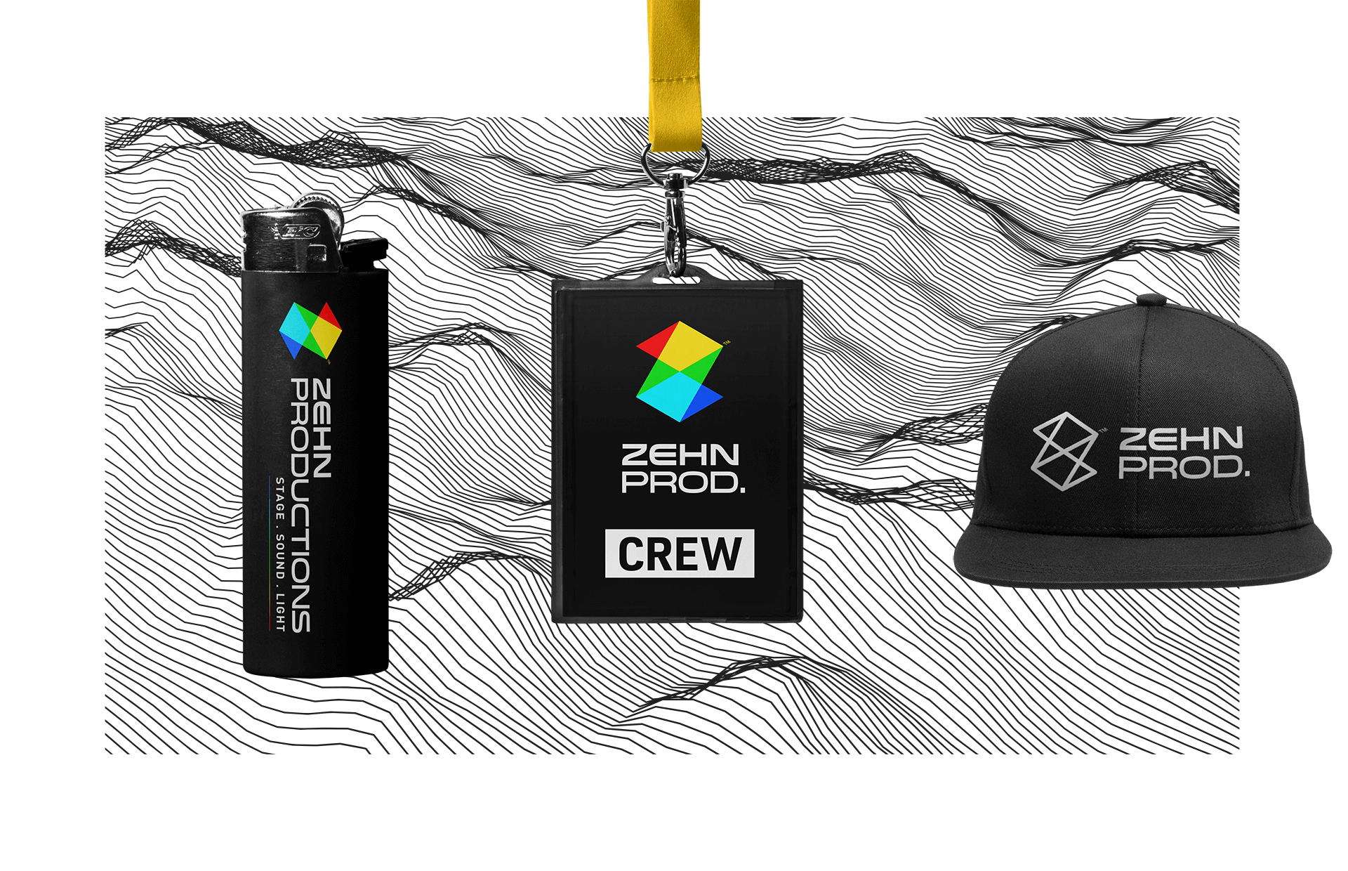
Zehn Productions ~ branding

Optimistee - branding


Same.
We're a multimedia design consultancy based in Cape Town, experienced within various creative fields. Collaborating with an established team of partners and suppliers, together we will solve your problem.


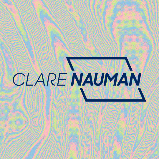
Clare Nauman ~ branding
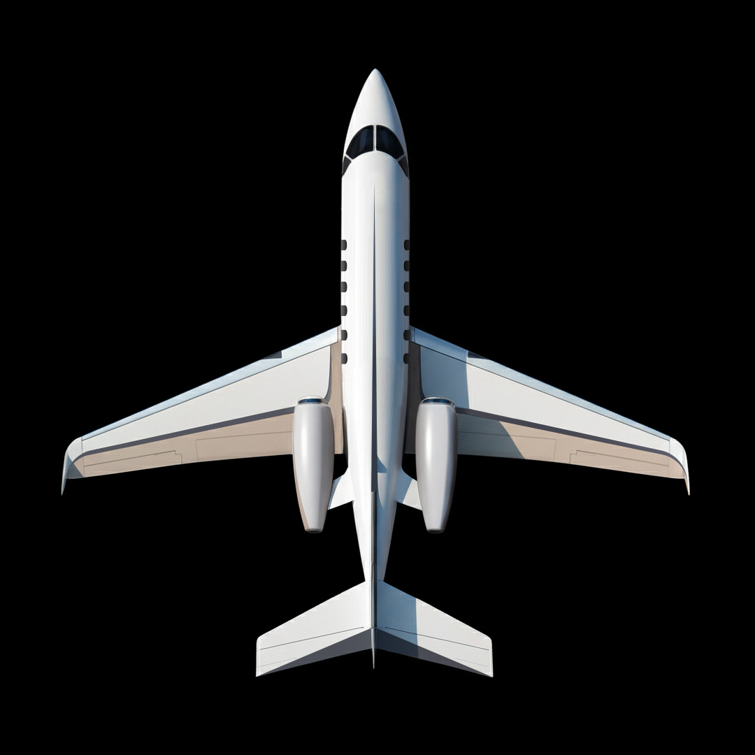
Hawker 850XP ~ aircraft graphic scheme
Creative Assistant ~ branding
Hans Zen ~ branding
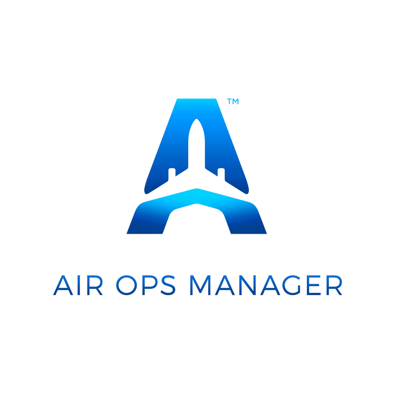
Air Ops Manager ~ branding & app UI / UX
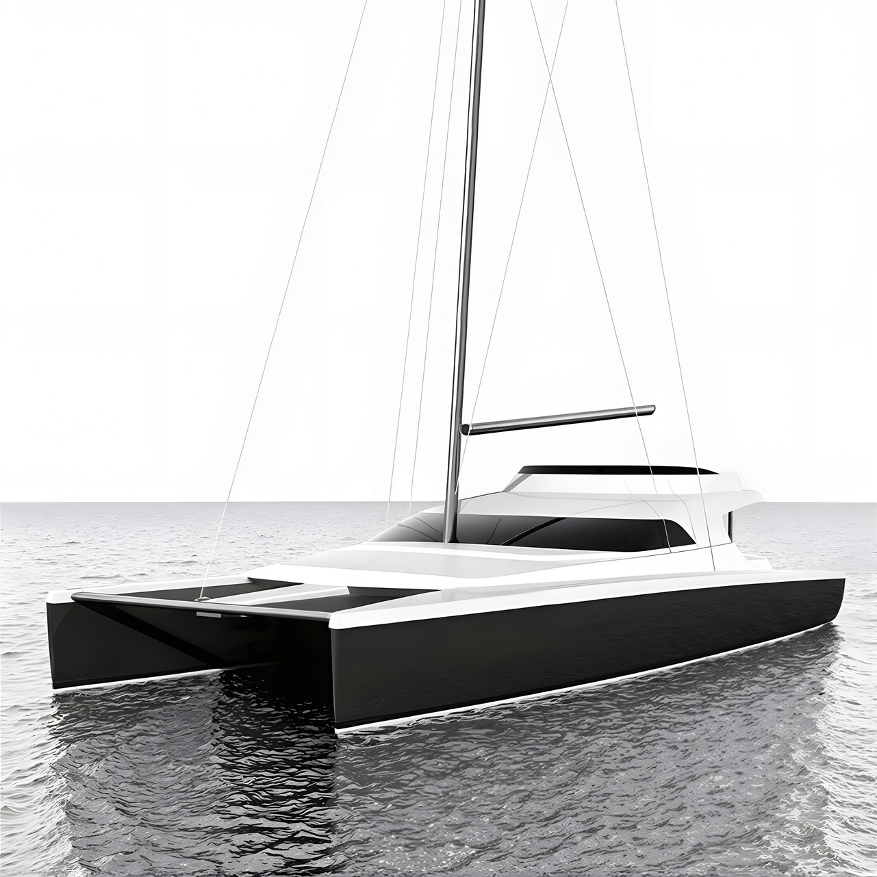
Du Toit Yacht Design - 75 Foot catamaran exterior ~ marine
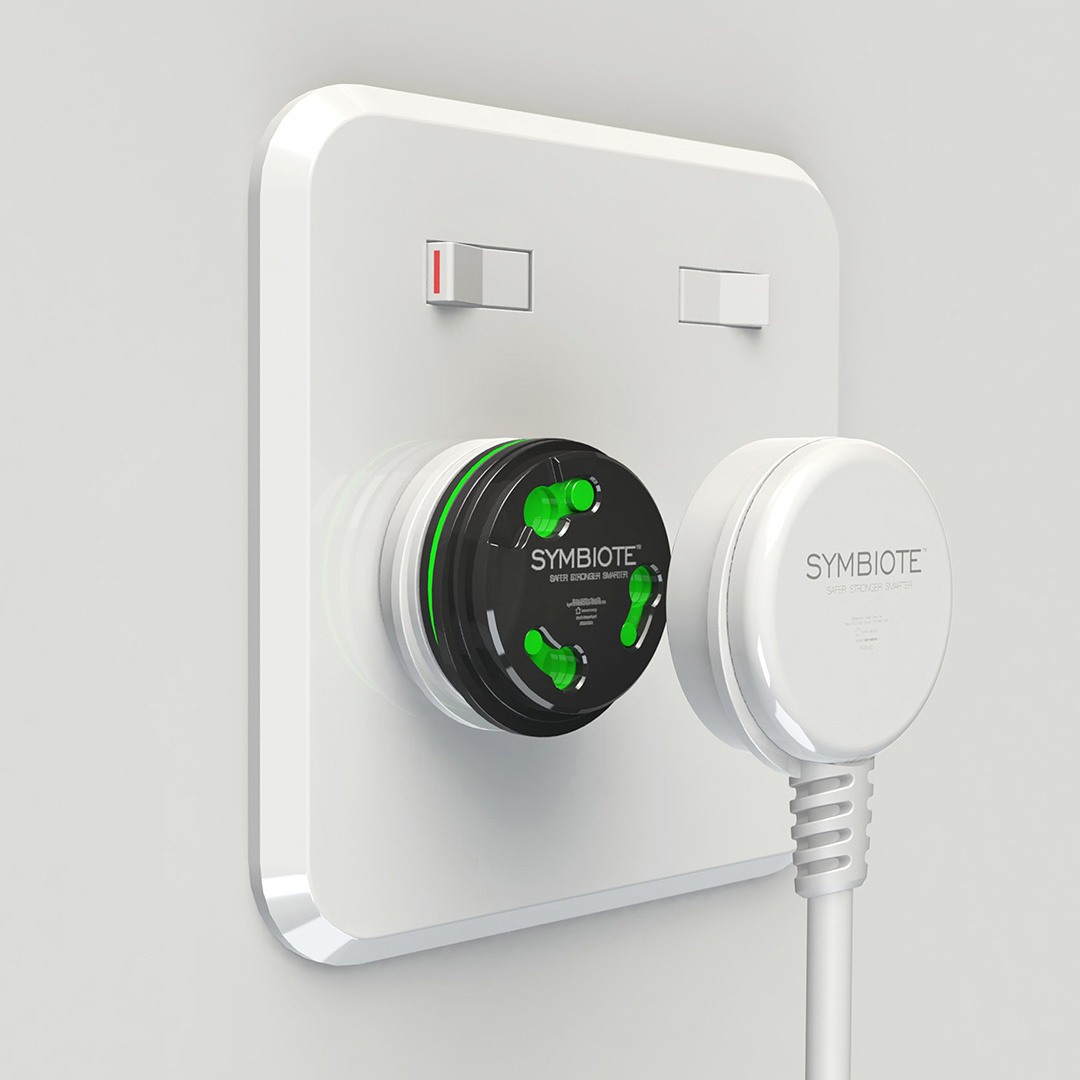
Symbiote plug system ~ product
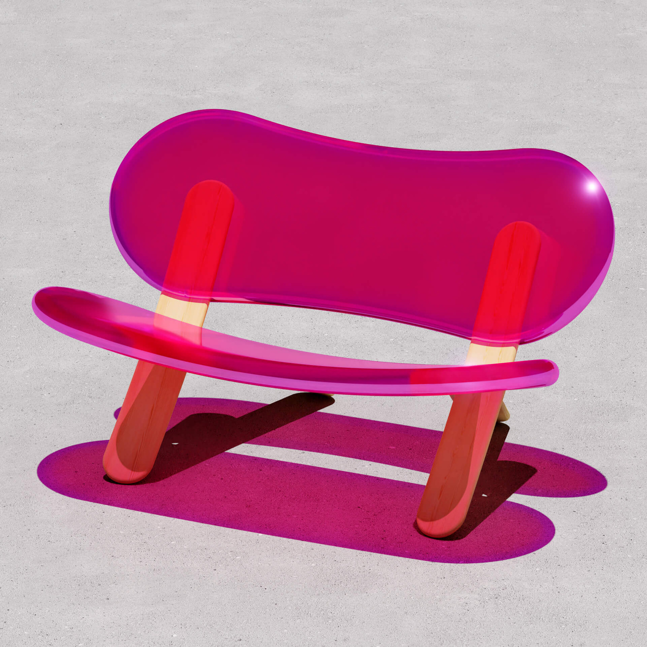
Lollipop bench ~ furniture

These are your logos ~ branding
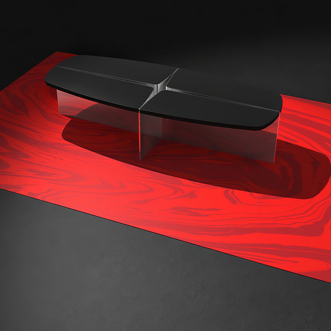
Quadrant coffee table ~ furniture
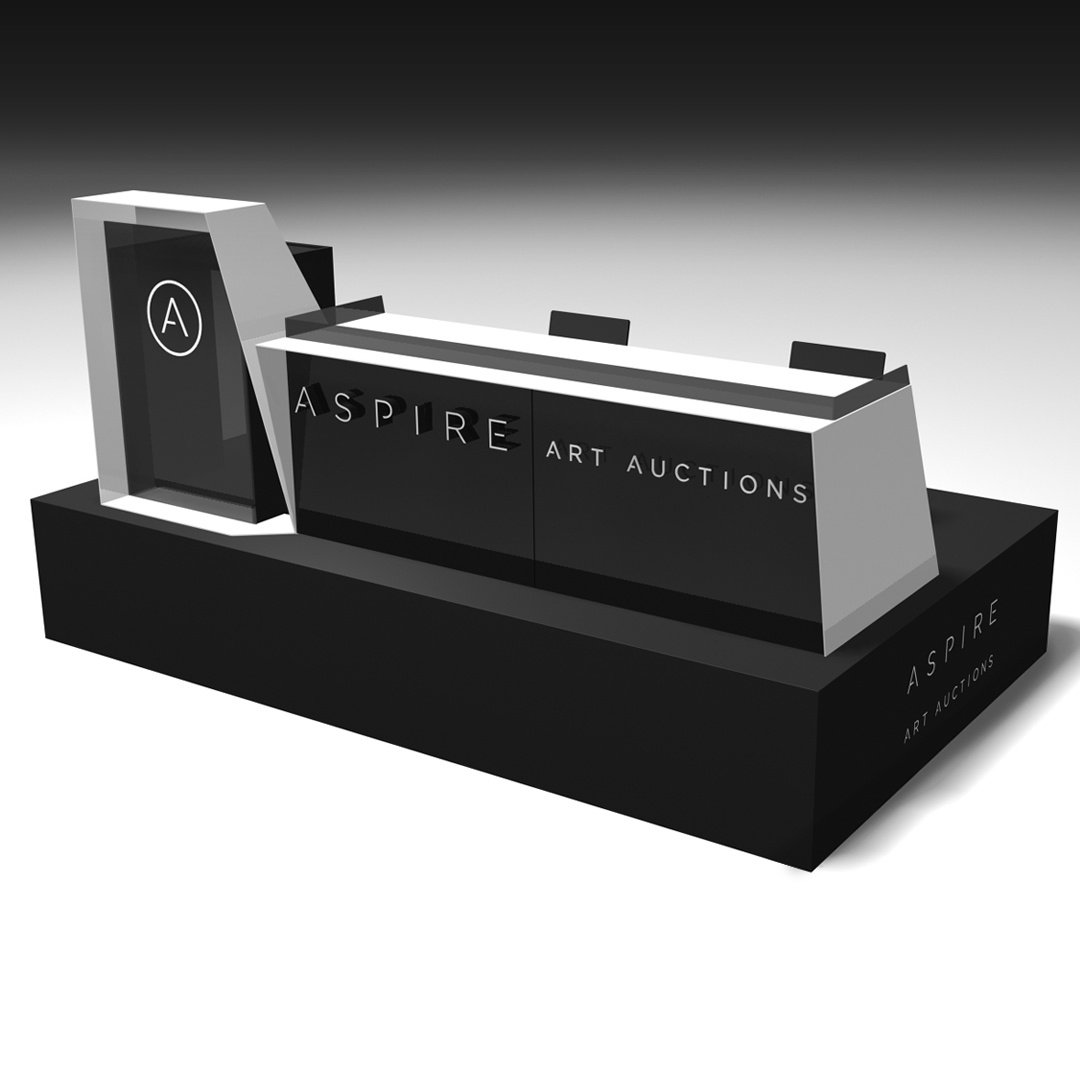
Aspire Art Auctions ~ auctioneer rostrum + platform
Zehn Productions ~ branding (since updated)
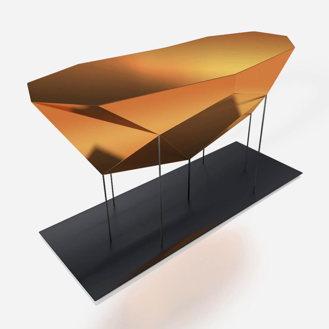
Faceted tables ~ furniture
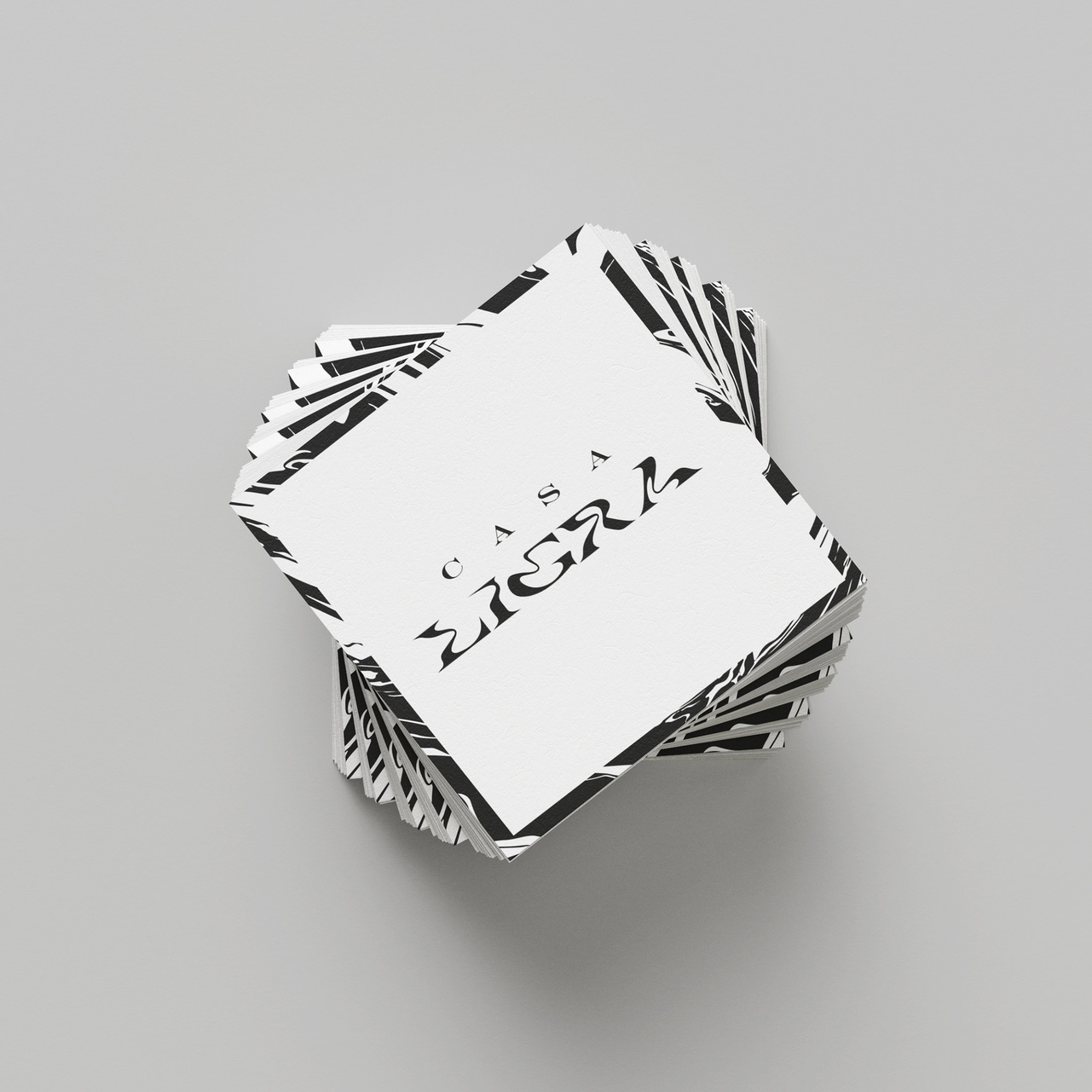
Casa Ligra ~ branding


Send word.


KONA ~ branding

Anker ~ point of sale
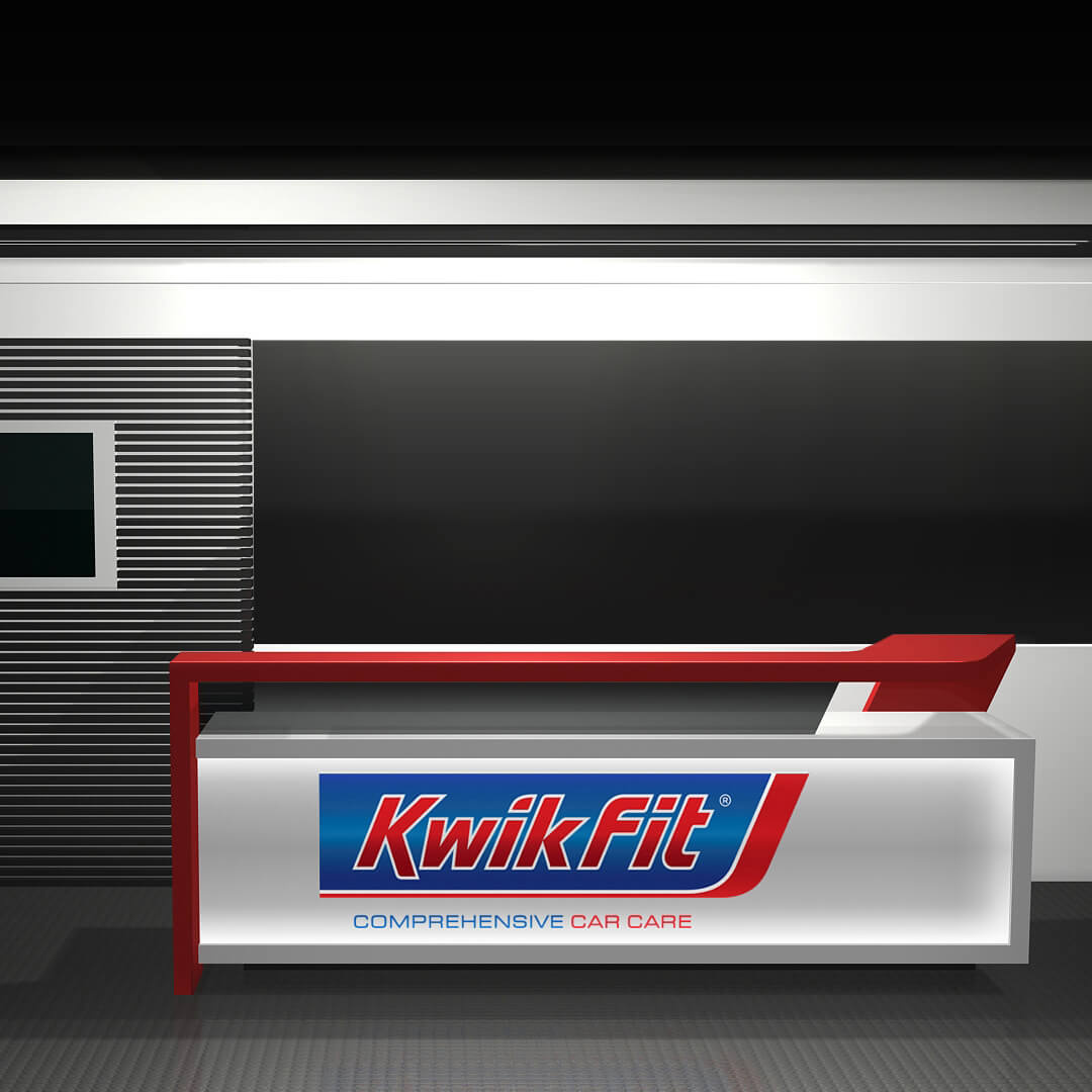
KwikFit ~ branding + interior
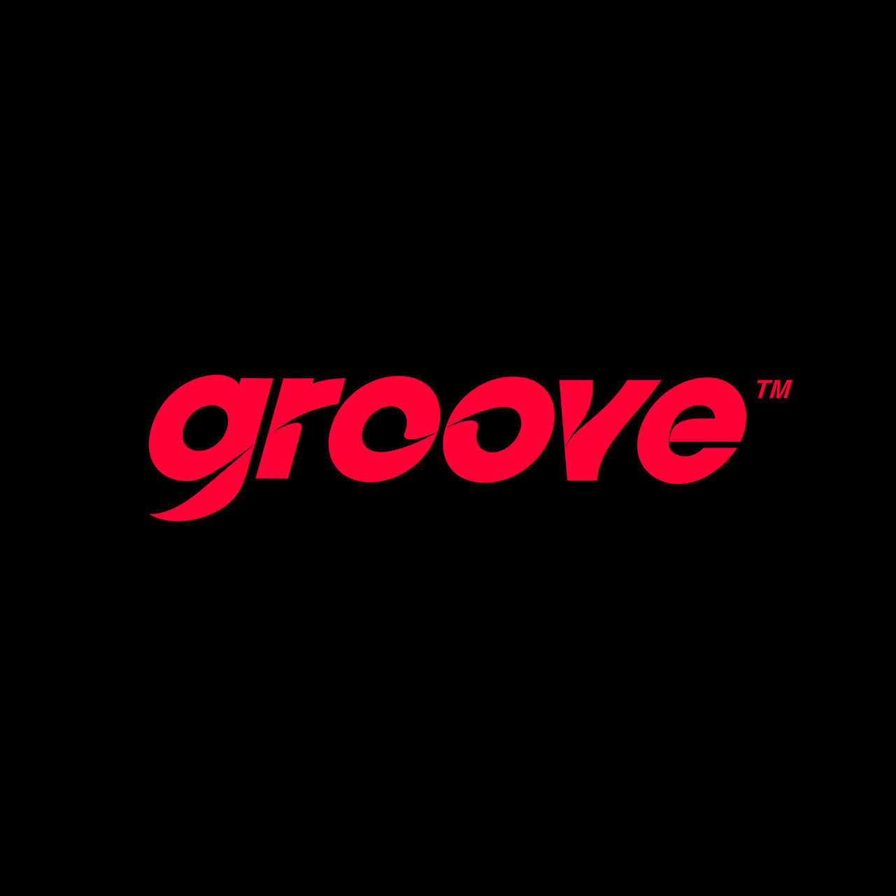
Groove ~ branding concept
Layered side table ~ furniture
Bonambra Consulting ~ branding

Melted shelves ~ furniture

Quantum Project ~ branding


Case studies for some of the listed projects are in process. To learn more about anything in particular, please get in touch.


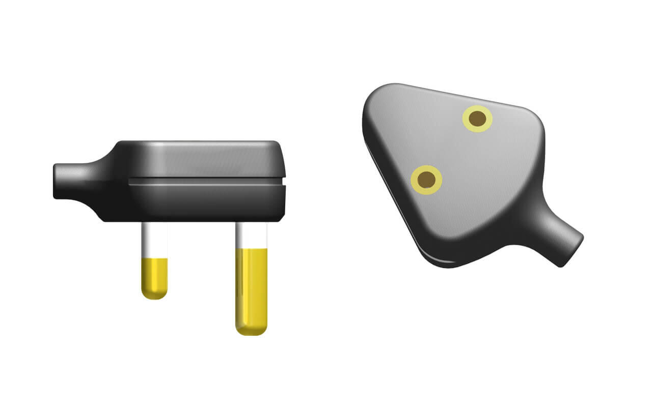
Symbiote plug system
Product design
This product fundamentally sought to improve appliance plugs and how they interface with local and international sockets, of which there are many types. Better overall plug design, with improved adaptability and usability, was the primary intention for the collaborative project.
Primary problem
South Africa uses two consumer plug designs, types C & D (type J in future). Initially, the client's idea involved combining the two, whereby the top surface of the 3-prong plug (D) would allow for a 2-prong plug (C) to insert directly onto it. The piggybacked plug would simply use the same circuit, negating the need for an adaptor.

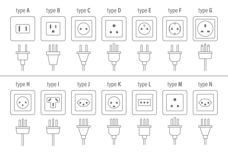
Greater design inefficiencies around South African plugs and countless 3rd party adaptors - plus related user frustration - expanded the concept into something more.
The target was now to develop a universal plug system, whereby a given appliance would ship with one cord-set for all markets. Each market would have a territory specific adaptor element.
TLDR: No one wants f**king adaptors.
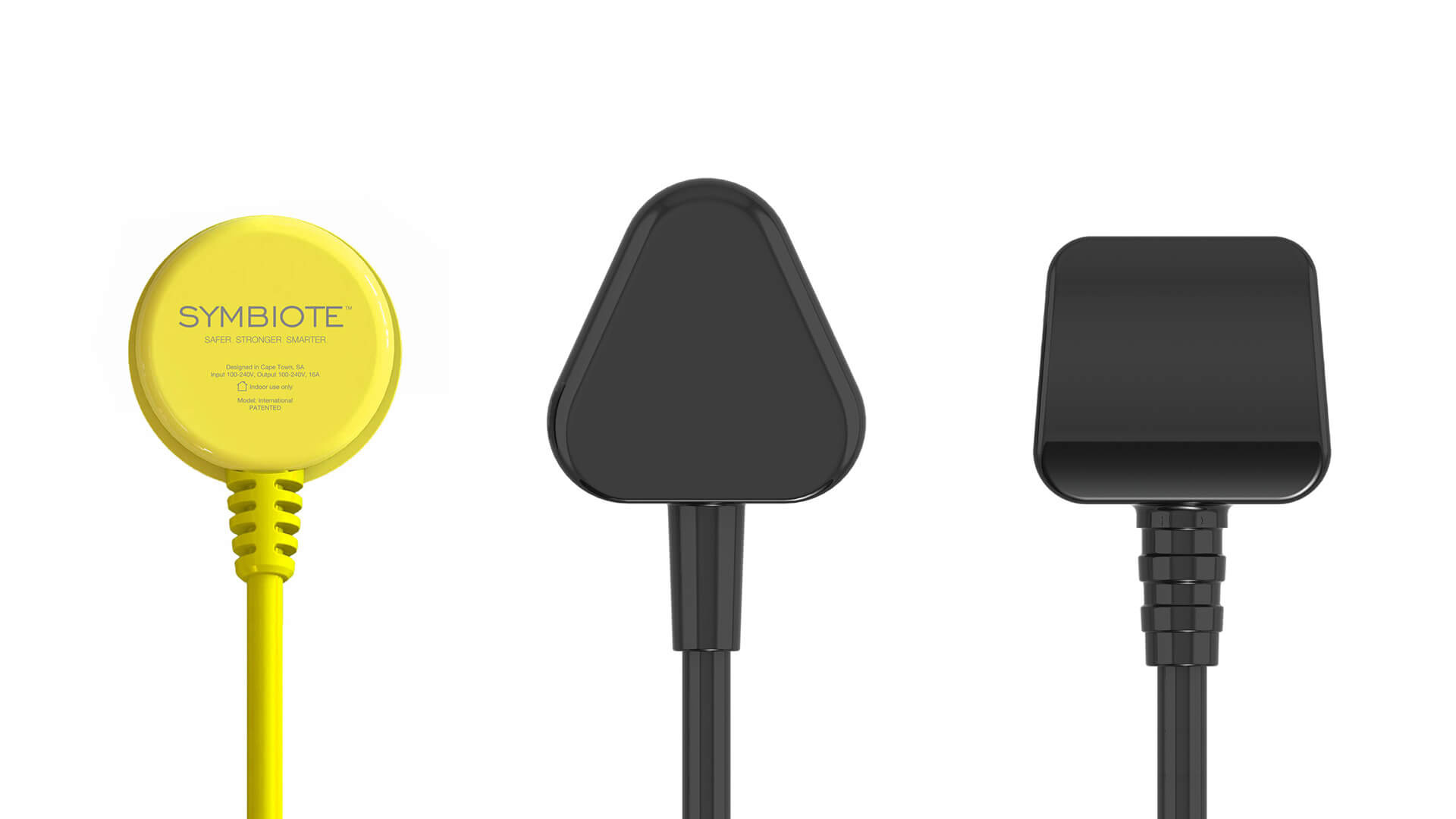
The first area of improvement can be seen in the smaller physical footprint for what we called the Conduit (in yellow). Beside it, a typical Type D plug (SA market) and Type G (UK market). Rebranded as SYMBIOTE.
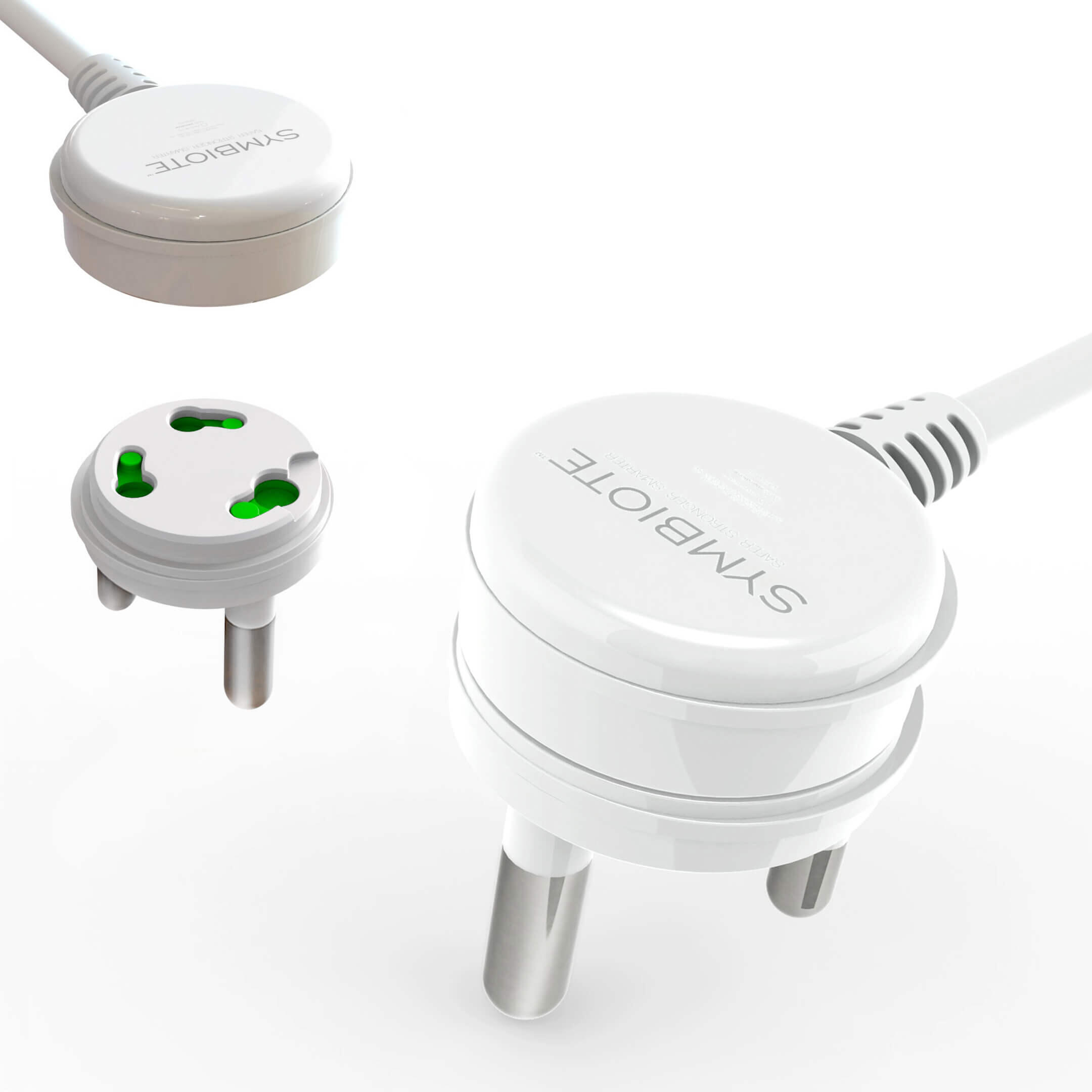
A two part plug, comprising a Universal Cord-set above a Territory Male. Once secured together through the patented Samson-Fraser interface mechanism (simply twists and locks), it works like any existing plug, offering benefits through its compactness, included fuse and adaptability.
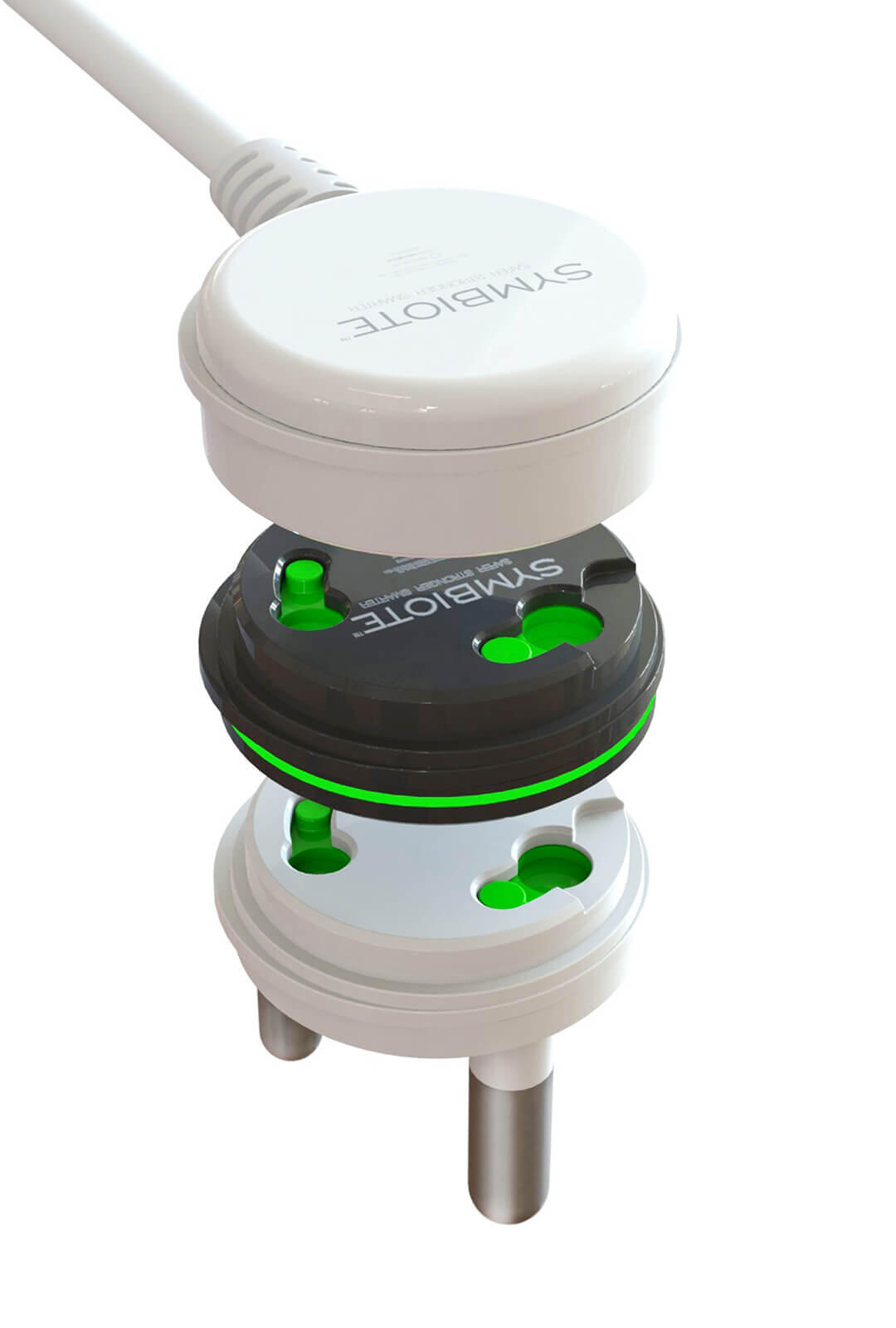
Below, the next step- the Symbiote Conduit.

Using the same patented mechanism designed for the territory specific male attachments, the Symbiote Conduit allows a second cord-set to piggyback onto another, utilising the same outlet.
A brief overview video documents this process, offering some visual comparison of territory male attachments and how the Symbiote system works.
A final expansion of the Conduit design included embedding further connectivity- Bluetooth, USB outlets, and so forth. This would essentially pave the way for remote operation of products (rendering them 'smart'). The grey coloured component illustrates and example of how this would look, utilising the patented Symbiote mechanism.

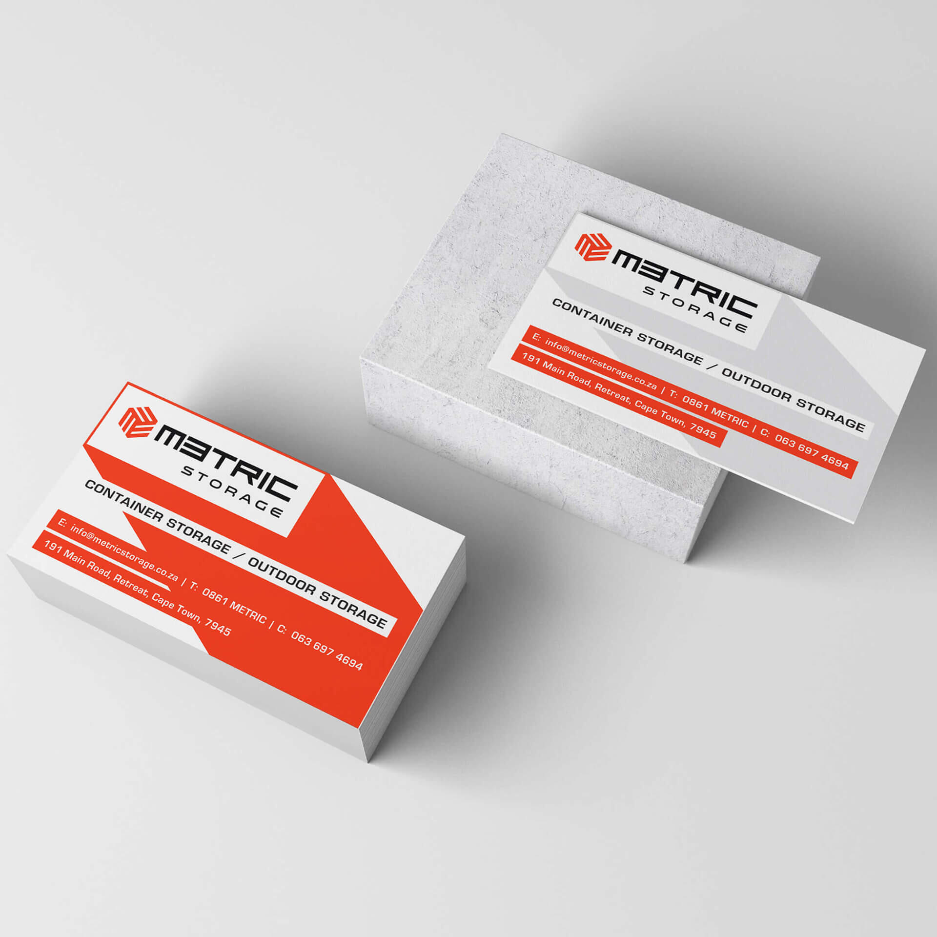
Metric Storage
Brand identity
A new container storage business based out of Cape Town, they needed a name & basic brand identity ahead of launching the company.
Emblem
The emblem design is based on a series of 'M' shapes, while also nodding to m³ (cubic metre). Strong, scalable, flexible.
Name
"The Metric System is a system used for measuring distance, length, volume, weight and temperature. It is based on three basic units with which one can measure almost everything in the world: M- meter, used to measure length; Kg- kilogram, used to measure mass; and S- second, used to measure time." ~ © Internet
Colour


A customised logotype was developed. It complements the emblem as a now complete primary logo, with an adapted version (above) allowing it to be used independently where necessary.

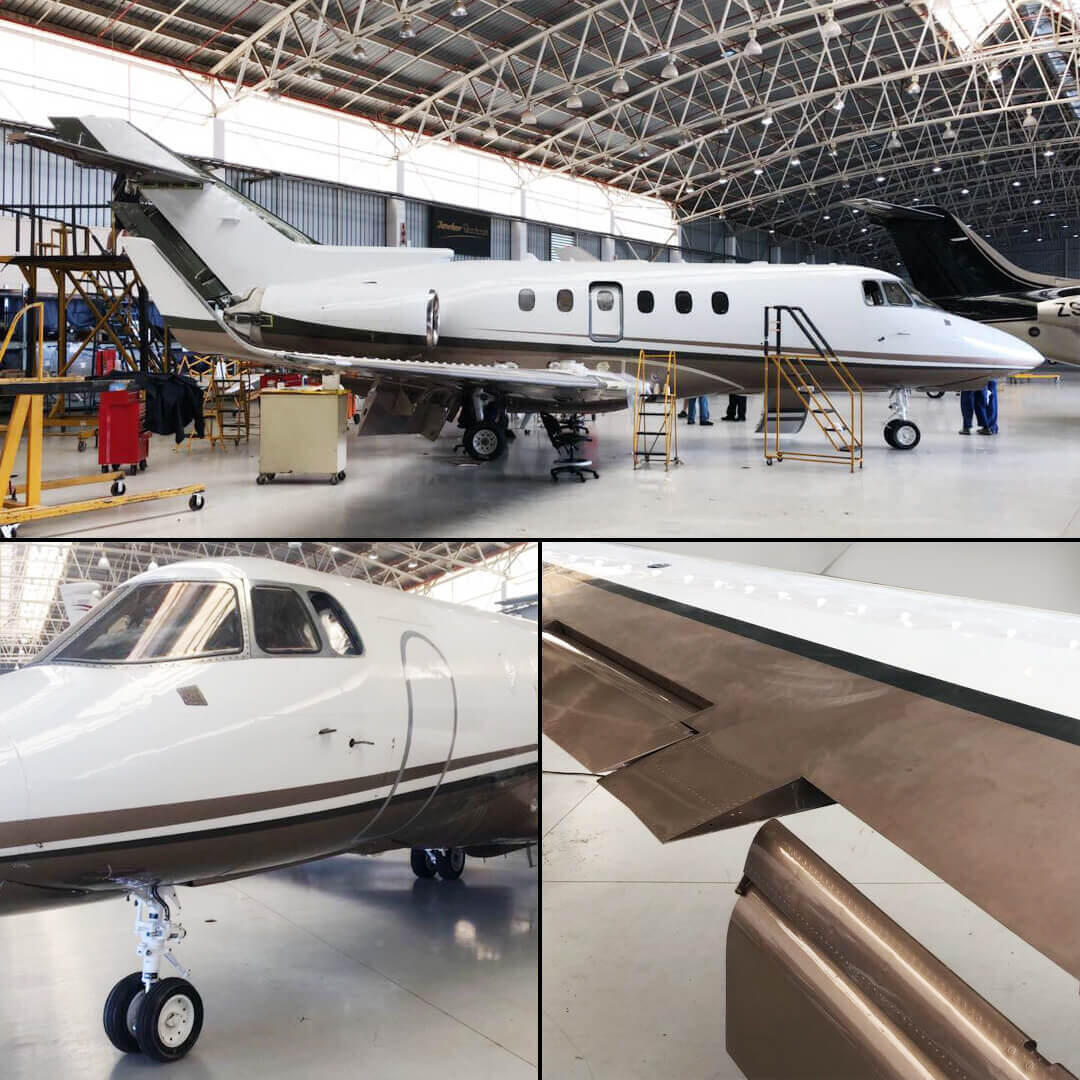
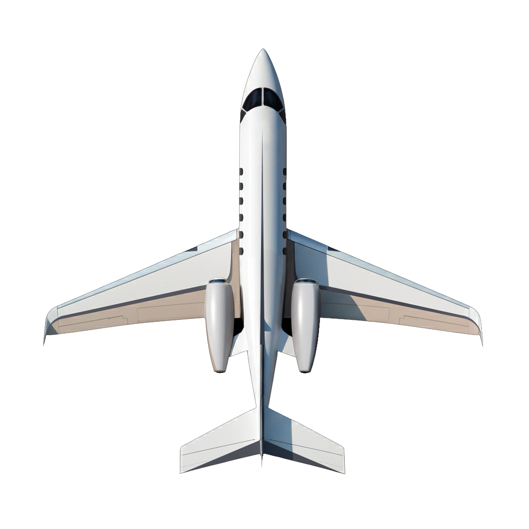
Hawker 850XP
Aircraft paint scheme
Tasked with designing a new paint scheme for a client's private jet, muted brown & beige tones were the only specific request, complementing the existing interior scheme. Seeking a clean and elegant result that would age well, the final graphic execution simply accentuated some of the jet's lines and stylistic cues.
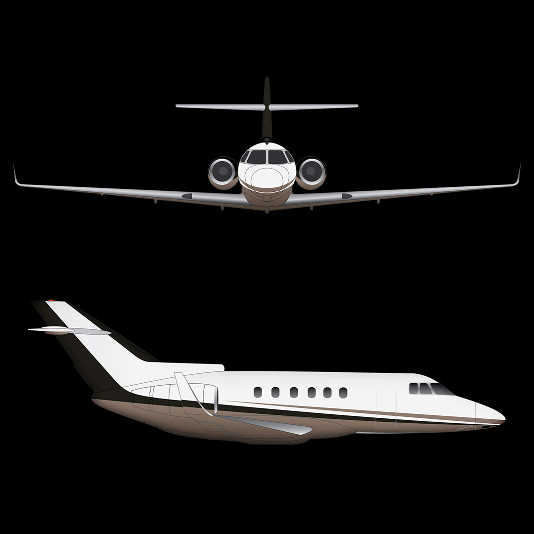
The aircraft was all white to start, with the new scheme focussed mostly along the lower half of the jet, including on top of the wings.
Below, some shots toward the end of the painting process. The two final colour shades were slightly metallic, offering different impressions across various light conditions.

Logos
Marks, get set.
Some logos, developed over time, for various clients.
Shacido
Creative Assistant
34° South
Institute for the Future of Knowledge

Viva Kombucha (nogo)

Casa Ligra

Cleaning Buddi
KONA Music

Clare Nauman
Pascal & Pearce (nogo)

Devland (update)
Home Skate Co. (nogo)

Equinox Experience
JCE Consulting

Seed of Light

Mo&Co
KwikFit
&Wild

Optimistee

Groove


Here are a few full colour logo treatments, sometimes with added effects and often designed with animation potential in mind, depending on industry and general brand focus.Logos are supplied in whichever formats accommodate a given branding requirement (eg. digital, print, signage).

The Really Awesome Company
Zehn Productions (nogo)

Ruby Jean Photography

Metric Storage
Seed of Light (nogo)
Bonambra Consulting

Equinox Experience
Waveshader
Blu Skye

User Design
Air Ops Manager (nogo)
Vytae

Solstice

Party Republica
Metric Offshore Sailing Team
Magna Karta

Keurbooms River Game Trails
Quantum Project
Zehn Productions
InsideOut

MindHive (nogo)
FastTrack EMS


We'll craft an identity for your brand, or refine the one you have.

Zehn Productions
Branding
Zehn Productions are an event production company providing audio-visual services. Their core offering extends to staging, lighting, projection mapping, visual effects and animation. We were tasked with updating their own brand identity, starting with a new logo.
Brief
The AV and events industries increasingly go hand in hand, with projected digital media becoming an integral component for success. They cater to human experiences, and so the drive to develop stimulating, enveloping events is stronger than ever.Zehn Productions, wielders of audio-visual magic, needed an impactful identity that was: Bold; energised; clean; and distinct.
Logo concepts
Below are some of the emblem explorations that we liked and continued with. Animation potential was considered throughout development, given the motion graphics intense nature of the business.
rhythm, energy, flow, precision, focus, scale
+
Lines together create an abstract 'Z' and take influence from a Zen garden's raked sand patterns.
+
A looping structure suggestive of process, while also representing a 'Z' (and 'P') for Zehn Productions.
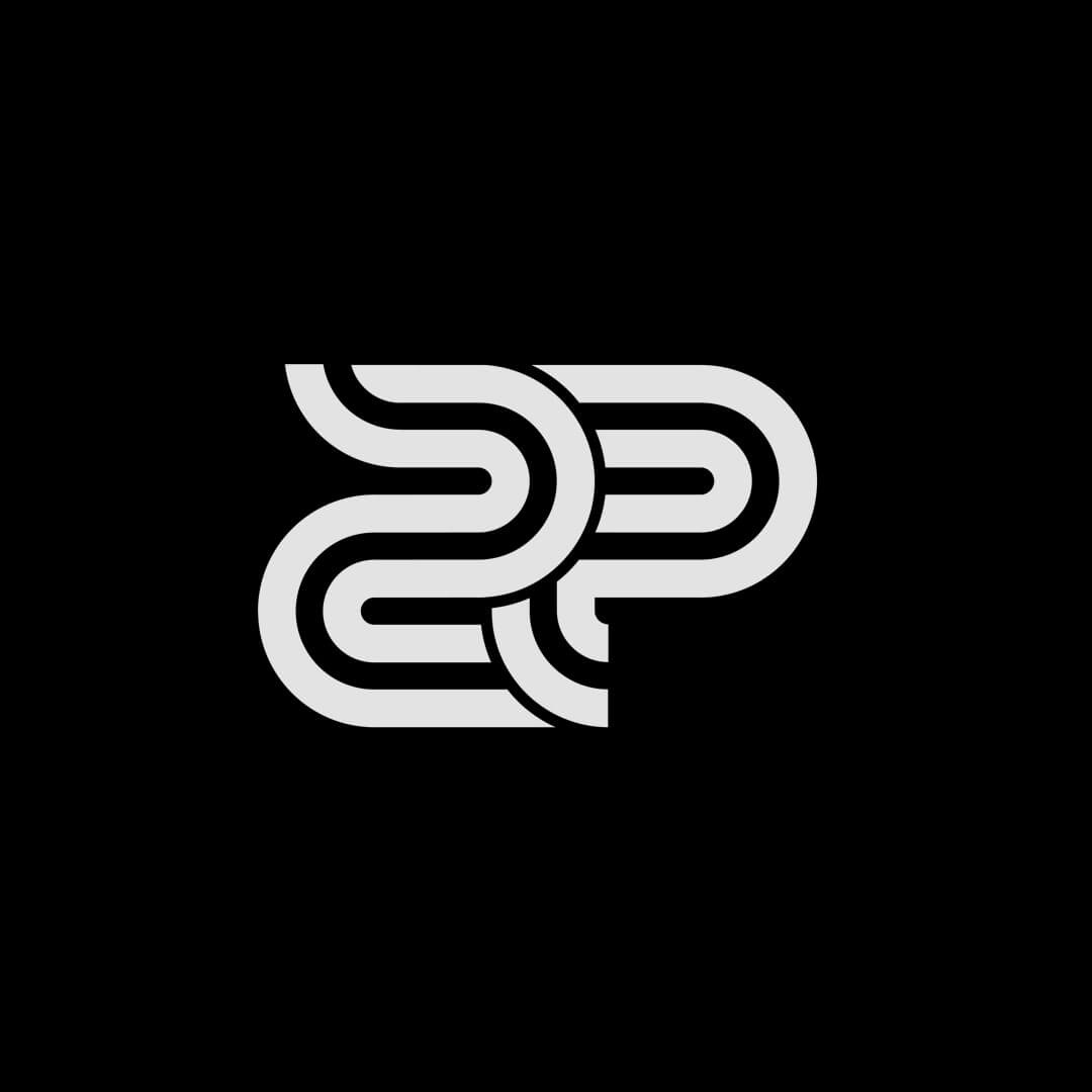
+
A 'ZP' combination, having now brought focus to 'Productions' in the name, and subsequently evolved...
Stage. Sound. Light.

Below, a last concept iteration before the (quite different) final solution - a stylised Z + P combination. It was intended to offer cool animation possibilities (the emblem), and again emphasised the notion of 'process,' resembling a conveyer belt in a sense.
'Productions' was abbreviated where necessary, the tagline optional.

Small trick on the compliments slip, with the logo emblem resembling a heart (when rotated) above an area for a brief note to clients.

Now colour...

XYZ axes ~ event building
RGB colour ~ light
Hexagon ~ environment (events, scaffolding)
Grid structure for graphic pattern usage
'Z' structure for Zehn ~ stage
Light + shadow ~ projection mapping
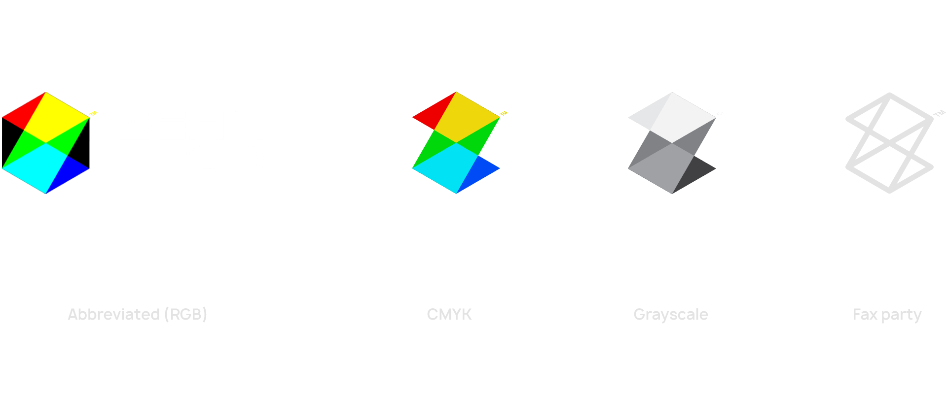
Final logo. It would mostly be used in digital formats and against black/ darkness, but for other applications, including print, emblem adaptions were developed:
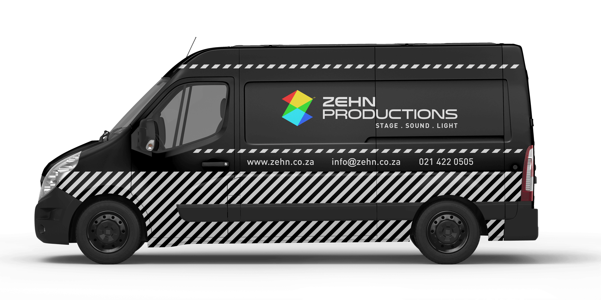
Real world media
Vehicle graphics use vivid lines to draw attention and emphasize the idea of motion. They are angled at 45° and reference the diamond/ 3D planes that make up the logo emblem, as well as evoking production clapperboards.
Crew gear...
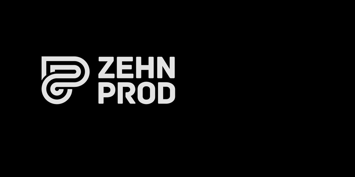
After six good years, we refreshed the brand identity again: www.zehn.co.za
Case study update at some point!

Viscous platter
Glassware design
Developed under User Design™
Invited to contribute a new luxury homeware / furniture concept as part of a joint exhibit with other designers, we elected to develop a glass platter. It took design inspiration from a few sources - contour maps, the notion of liquidity & viscosity (hence the eventual name), sand dunes and other undulating landscapes.
Concept
Five homogeneous profiles collectively form an organic, irregular shape. In plan view, these profiles inset smaller and smaller across five glass layers, creating the aforementioned contour effect, itself visually amplified by the translucent overlap effect of the stacked glass.
The five inner shapes resembled valleys and acted as small bowls, their varying size able to accommodate whichever food (or other) items worked best in each.
Execution
Above the five layers of each bowl was single piece of glass (all glass was waterjet cut), UV bonding the entire structure together. The minimal weight of the bowls meant that the finished product was sturdy and relatively light - an initial concern during development.Optional lasercut perspex lids for each of the five bowls allowed the platter to have items placed on top of it if needed, expanding functionality and offering a visual contrasting element, given composite colours are so extensive.


Waterjet cut 4mm glass layers
UV bonding of layers
Modular, lasercut perspex lids
Small silicon feet on underside
Final dimensions: 640 x 285 x 24mm

User Design
Contemporary furniture
Originally intended as an industrial design venture, User Design (co-founded) became a furniture and interior focussed company. We designed and produced our own products, for local and foreign markets, also taking on some bespoke commission work. These are some of the things we made.
First, the logo and brand media. A custom wordmark, lowercase 'user,' it sought to reflect how we envisioned the brand ethos - modern, strong, future embracing, and somewhat maximalist in treatment. Intentionally symmetrical, each end suggestive of action / reaction, cause and effect...
The split letter 's', as well as maintaining visual symmetry, also conveyed this idea of interaction between person and item, people and environments.


Company business cards. Their design invites the eye into a 3D environment made from flat graphics, and conveys seeing things in different ways. Also emphasis on light and shadow.
Furniture
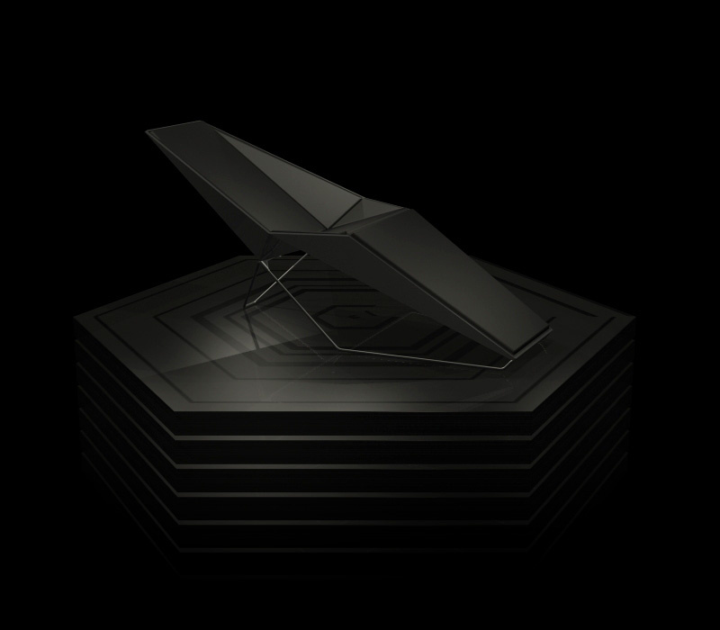
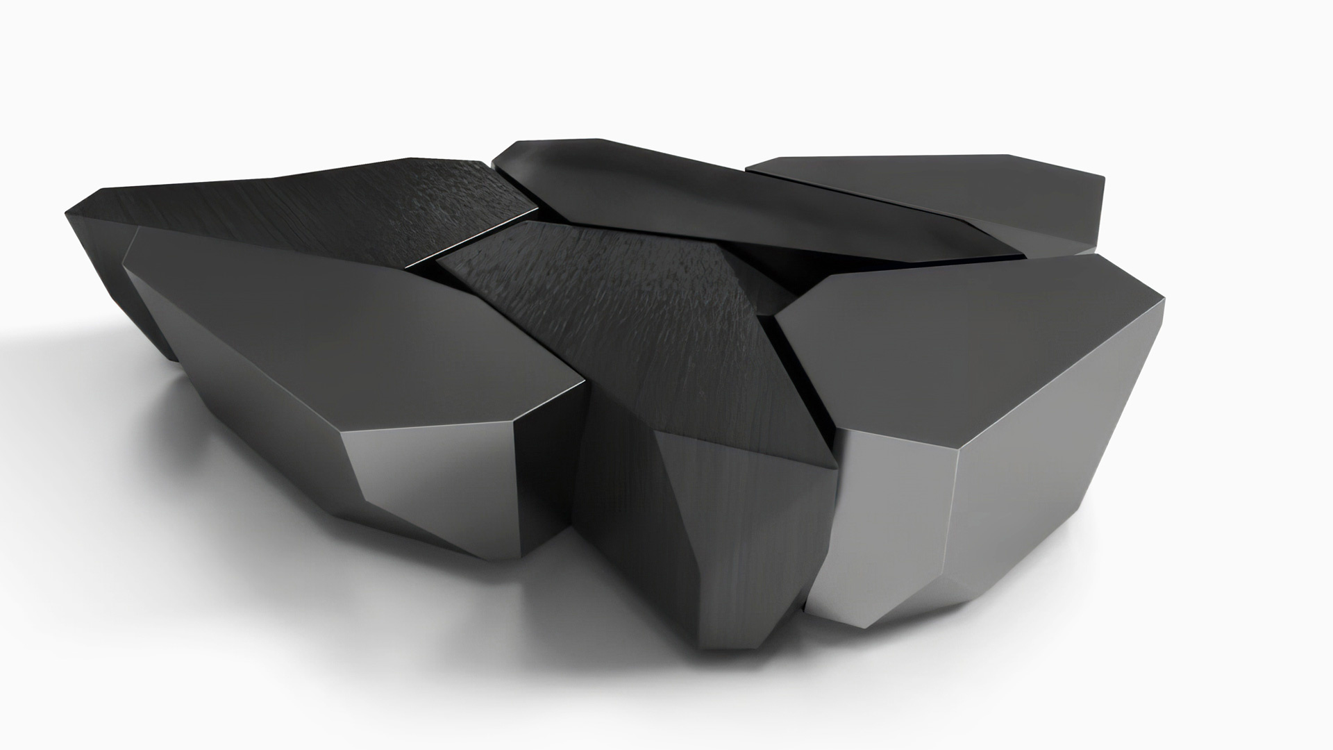
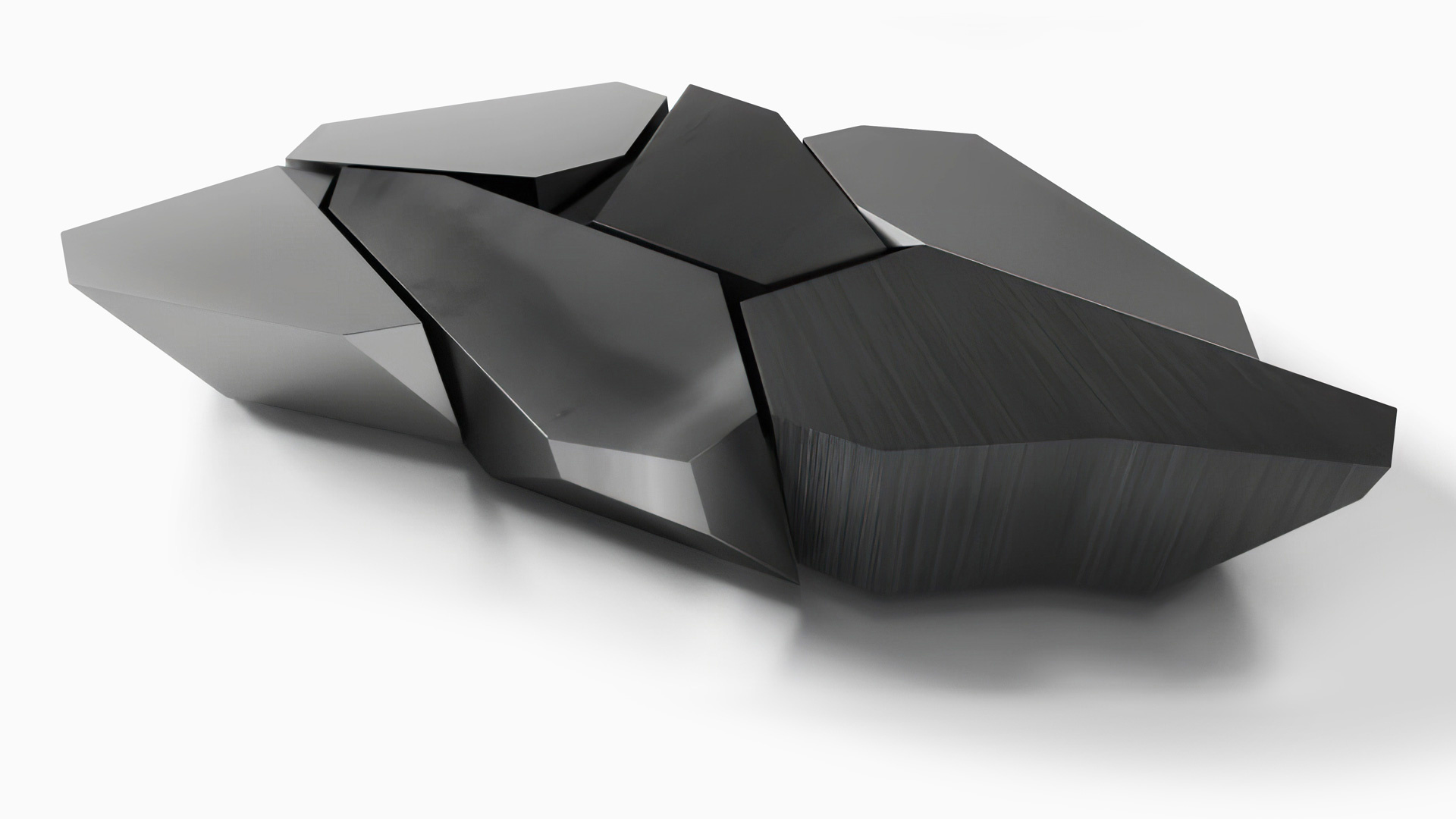
These are a couple of client commissioned concepts - starting with a modular series of faceted tables that come together to create a larger coffee table structure. Each of the five pieces would be treated in a different metal finish, together a seeming group of 'space rocks'.


A hallway table was also conceptualised, and though also only a proof of concept rendering, ultimately offered inspiration for other things. The table was intended to have contrasting brass plating against treated mild steel.

Our love of contemporary architecture was and remains a big inspiration.

DELTA CHAISEWith a moulded fiberglass body (black, grey or white) and stainless steel legs, this product started as a side profile sketch and took a fair amount of refinement to get right. It was made to order and featured suede / leather cushions, with headrest and side cushions available optionally. And yes, it was comfortable, with plenty of ergonomic testing.


FORMAL SOFAInspired by origami, this sofa's aluminium framework appears to defy gravity from some angles. It's overall style follows the general feel described earlier, with a hard edged and clean final appearance. We eventually modified the design slightly, and also made shortened, sofa chair versions per client request.


460 COFFEE TABLEThis steel table (powdercoated satin or gloss) played with a twisting theme, with legs reaching for each corner. It also sought to compliment the origami inspired sofa we'd made at that time. The original design didn't have supports rising up to the underside of the table top, but were later added for increased rigidity.


TENSION SIDE TABLEA design that began with a hexagonal top, subsequently inspiring a doubled up leg structure that was CNC cut (steel) and bent to shape, the table explored geometric language in line with the range aesthtic we were developing. It was available in powdercoated colours, as well as brass plating, and came in two sizes.


USER ASHTRAY / VESSELA cement moulded ashtray that simply followed the geometric, faceted design language we had been playing with, they sat on CNC cut wooden bases. Their raw and tactile quality provided an architectural material feel to any environment in which they sat. Images to be updated.


SWITCH COFFEE TABLETaking its name from the overlapping leg structure, this coffee table had polished stainless steel framework with a bronze or smoke tinted glass top. The glass was secured with silicon pads on top of the legs' middle section, relying on weight as opposed to the originally planned UV bonding.


Custom furniture projects available on request.


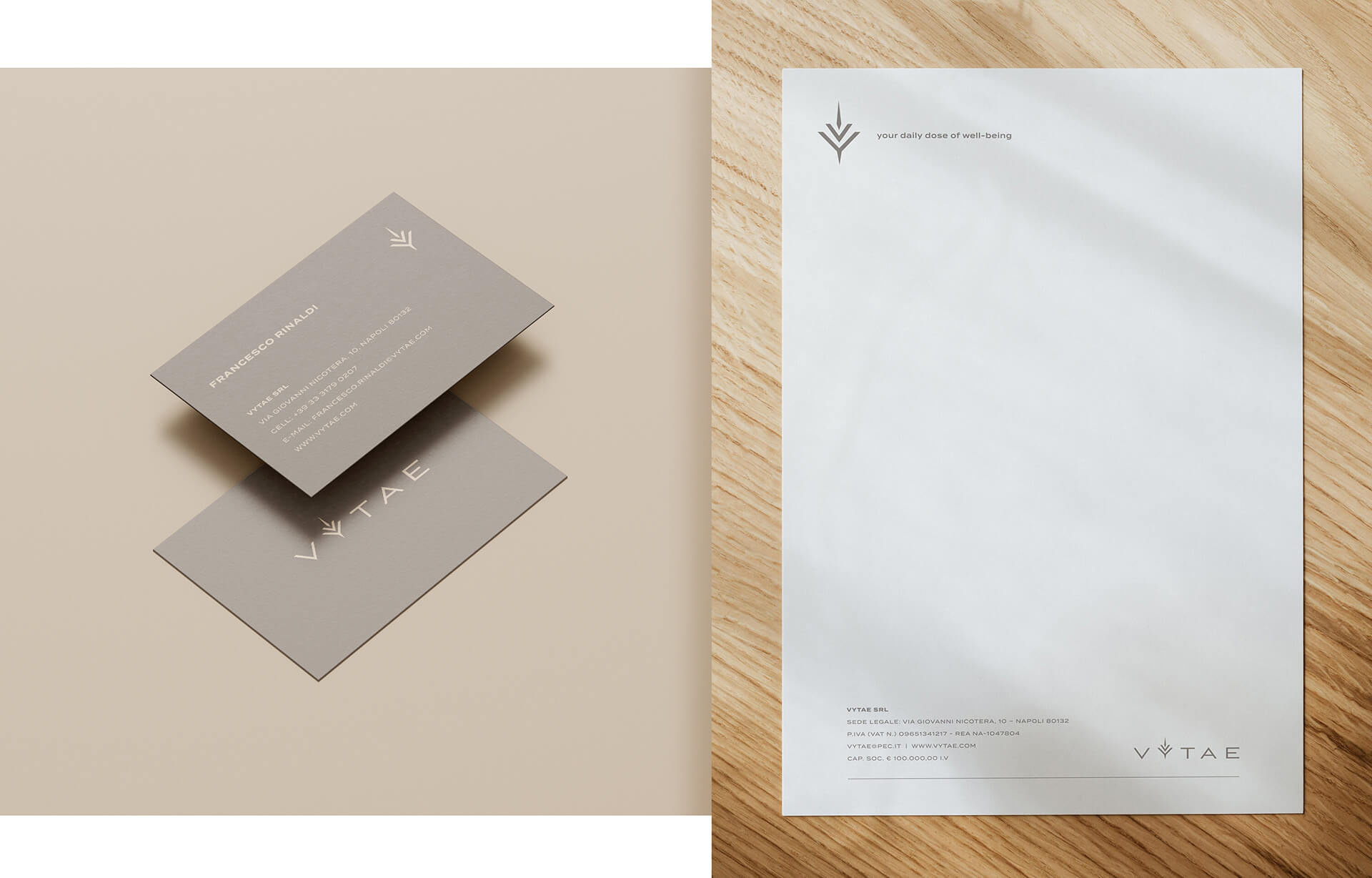
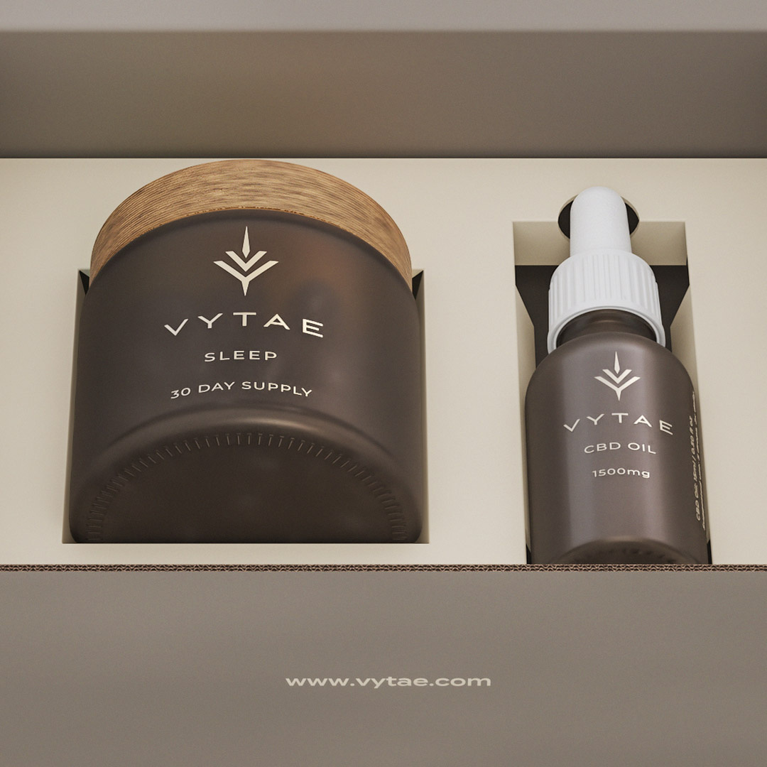
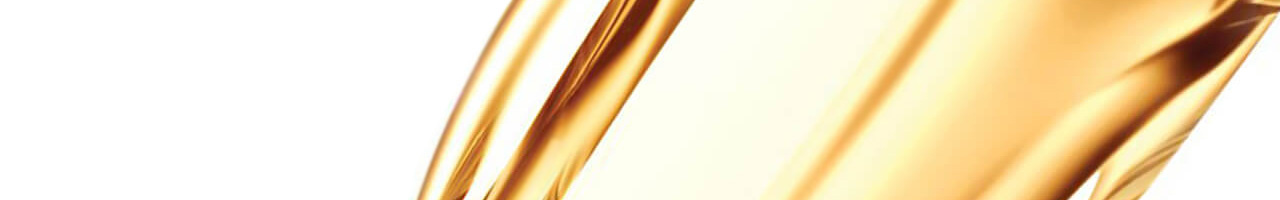
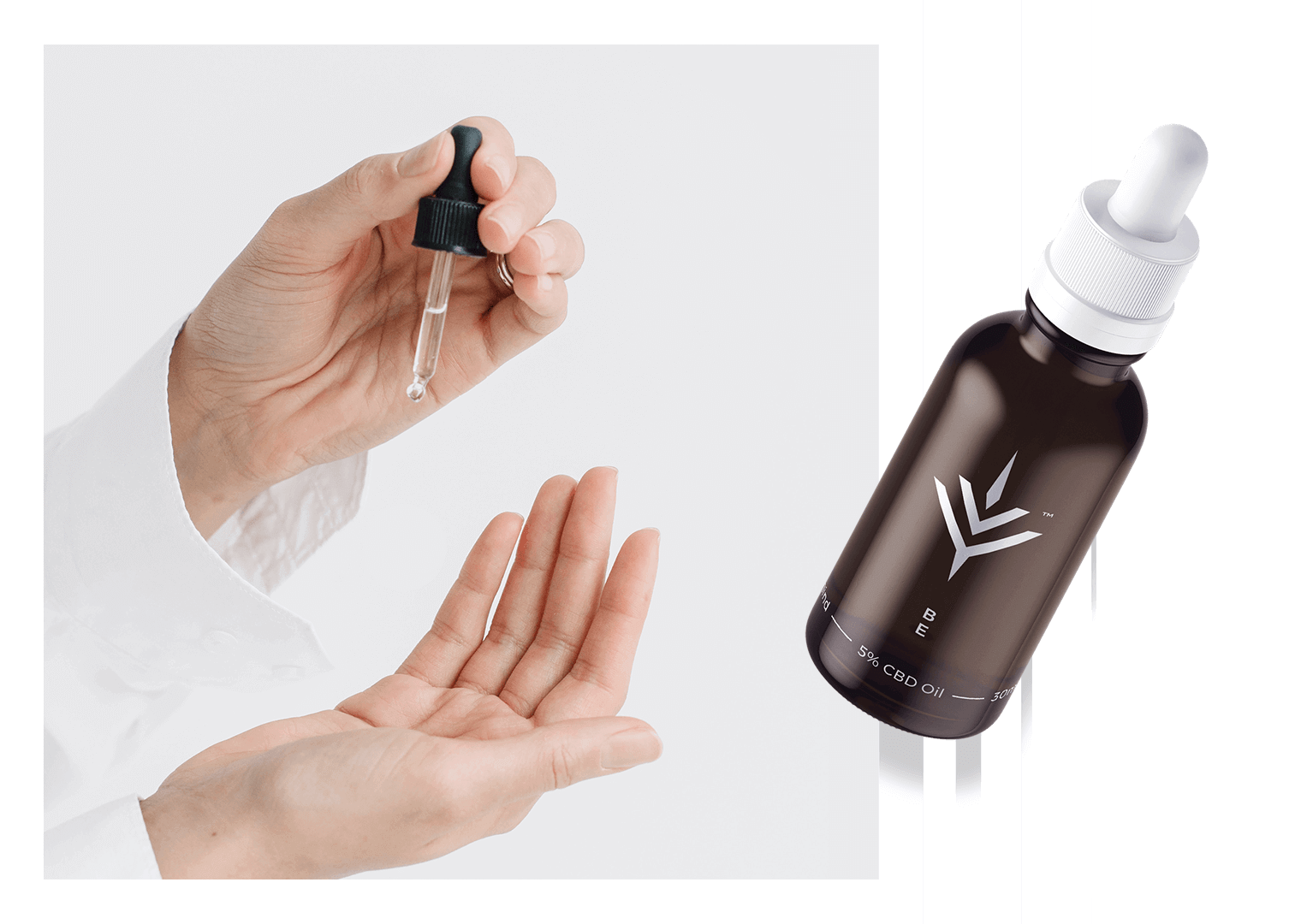
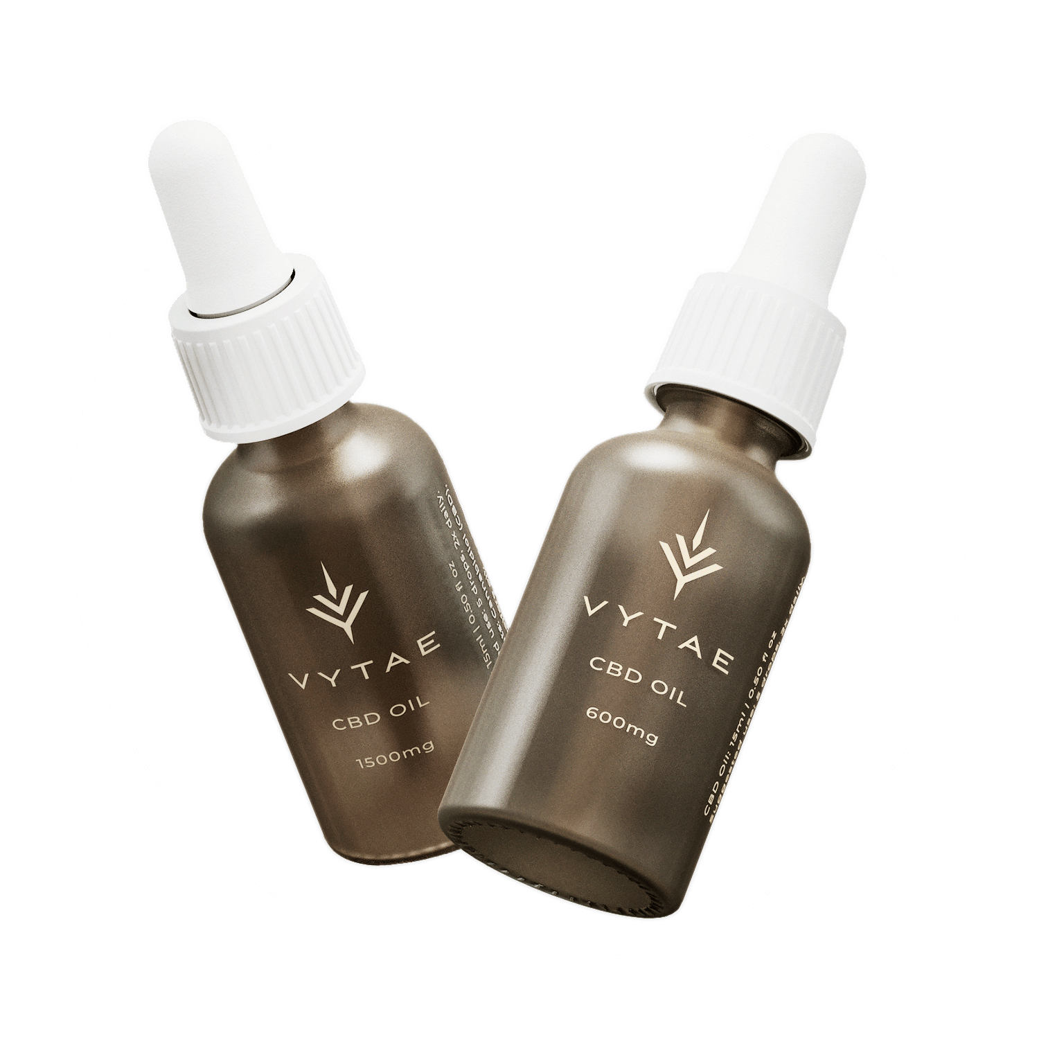
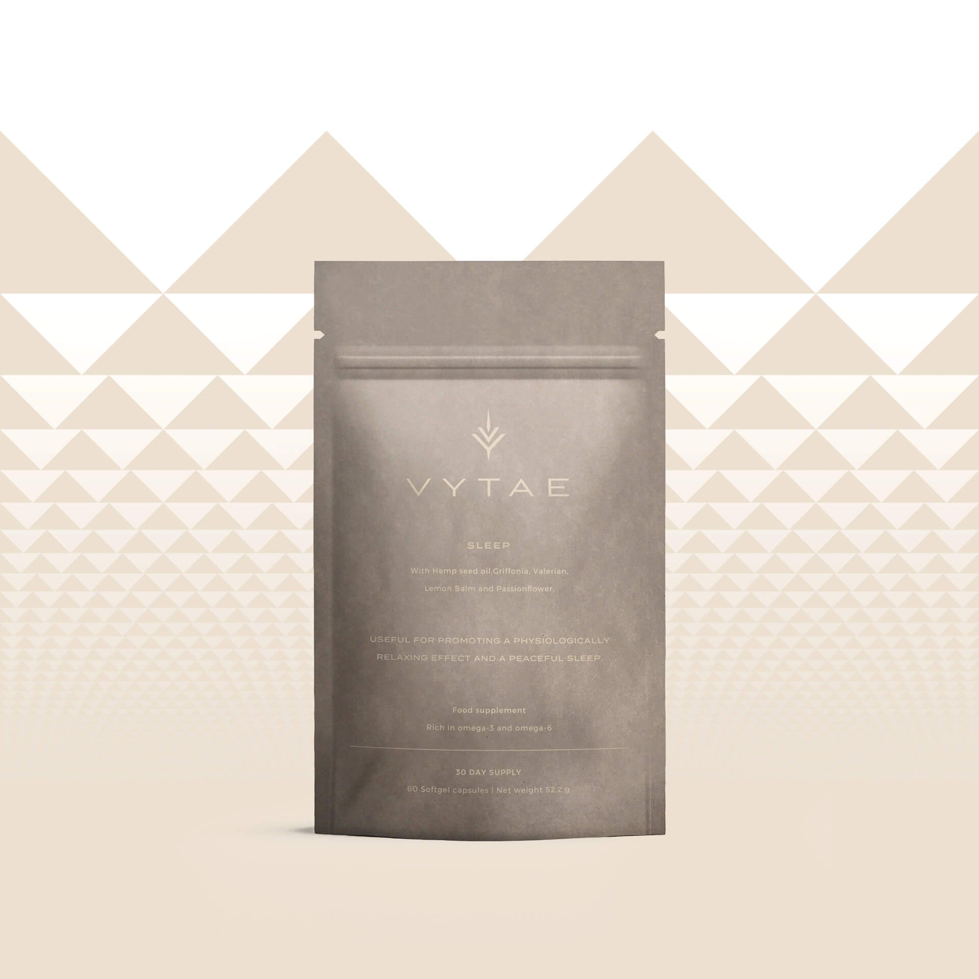
Vytae
Branding & packaging design
Vytae is an Italy based CBD oil & capsule producer - a fast growing industry that caters to physical & mental well being. The clients required a brand identity for their new business, from logo and graphic elements, to packaging and 3D visualisation. They sought a minimalist, pared down aesthetic, inspired in part by the intended biodegradable packaging.
Vytae brand keywords
Nature
Care
Science
Sustainability
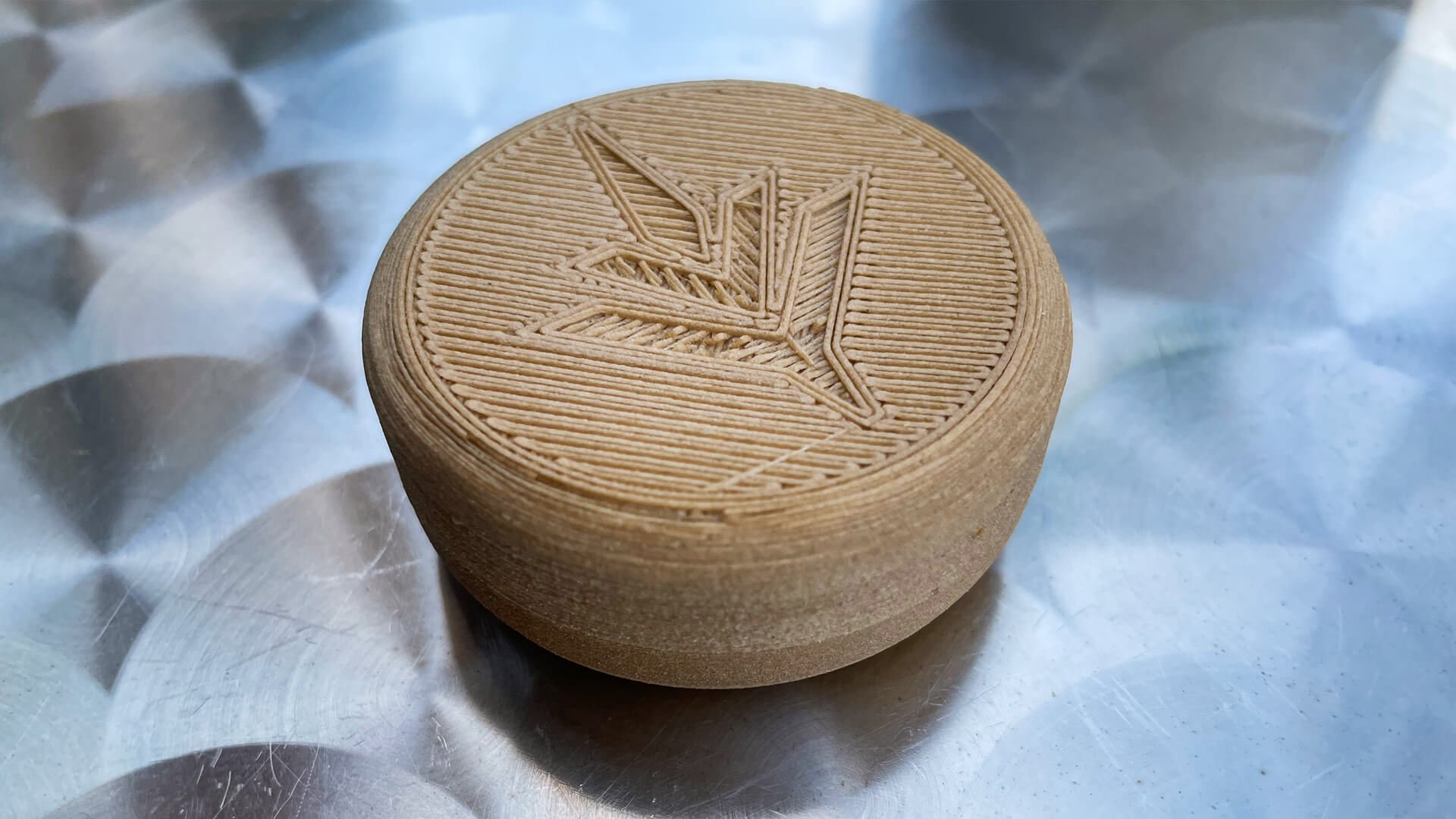
Logo development
The final logo began as a wordmark, itself based on customised type. The letter 'y' expands into a marijuana inspired geometric leaf, via added elements. It also began what would become a logo system, with each version being used within a given format.The emblem was also worked into a pattern design.


Packaging development
Required product / packaging items
| 1. Oil dropper | bottle graphics |
| 2. Capsule jar | jar and box graphics |
| 3. Capsule holder | case label |
| 4. Capsule refill | pack graphics |
| 5. Shared product box | box graphics |
It was later decided to package the oils and capsule jars together - at least during launch - given most buyers were more likely to try both.One of the intended product ranges was titled 'be' but later changed.


Some of the concepts incorporated a 'V' or chevron shaped elements across the graphics. As well as tying into the name, they were intended to project the idea of physical and mental upliftment - calm against anxiety - with pattered lines/ elements contributing a soothing quality (this could also be extended to tactile box elements such as embossing).
Early case labels were explored (see below), before it was determined that they be made from bioplastic entirely.


Final brand & packaging media
Your daily dose of well-being.
Simplified product range ~ two primary options for both the CBD oils and capsules:
Sleep /
With Hemp seed oil, Griffonia, Valerian, Lemon Balm and Passionflower.Useful for promoting a physiologically relaxing effect and a peaceful sleep.Food supplement
Rich in omega-3 and omega-6
Mood /
With hemp seed oil, Hypericum, Rhodiola and Rosemary.Useful for promoting a physiologically relaxing effect and mental well-being.Food supplement
Rich in omega-3 and omega-6
Colour system

Pantone: 4247 C
#d1c1a8

C: 57 / M: 53 / Y: 56 / K: 2
#66605B

Pantone: Warm Gray 7 C
#968C83

Pantone: 4223 CP
#686F4E
The final product vessels were sandblasted glass, complimenting the capsule jars' having bioplastic lids. These provided slight variation from sample to sample, which was in fact welcomed and contributed to the intended raw, minimalist aesthetic.
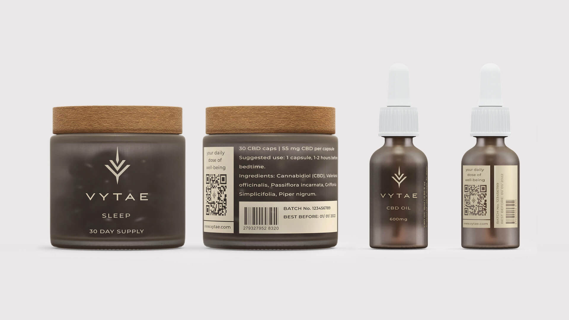
A single box option to start, with several inlays to accommodate product configurations. The box exterior was extremely minimalist, with only the Vytae emblem and web address. While being in tune with the brand identity, this also made it easy to add new CBD products/ ranges within the existing packaging, modifying box inlay specification as needed.
The portable capsule case - intended to hold a number of capsules (lasting several days' consumption) - was made entirely from bioplastic. This complemented the jar lids, and offered a pleasantly raw tactile quality while holding them.
The sealable refill packs, all made from paper. The final brand tagline would be 'your daily dose of wellness'.

Stationery
Again reflecting the same minimalism as the packaging, stationery was limited to just business cards, letterhead and email signature template.